Uber brand identity evolution.
At the beginning of 2020, Uber was still reeling from the effects of the pandemic—what was once a profitable mobility business had disappeared over night while a developing delivery business exploded in growth. These shifting priorities demanded a renewed focus and story for the company's future. No longer just rideshare. No longer just food delivery.
With a new brand northstar in place, "Reimagine the way the world moves for the better", we set out to reimagine what it means to build a brand identity. Our goal was to inspire through storytelling—to build a brand identity that carries a throughline from concept all the way to design.
In partnership with Jones Knowles Ritchie, we began to evolve the brand in a purposeful way, driven by story and guided by the renewed focus of Uber.
Vision
Inspire possibilities.
Design a brand language that inspires consumers to imagine Uber’s potential to make their lives better.
Goals
Express a new brand strategy.
Reimagine the way the world moves for the better.
Create a cohesive vision.
Align our brands under one identity.
Compete in a commodified landscape.
Mean more to users than we do today.
Build brand distinctiveness.
Invest in what makes us uniquely Uber.
A lack of distinctive assets.
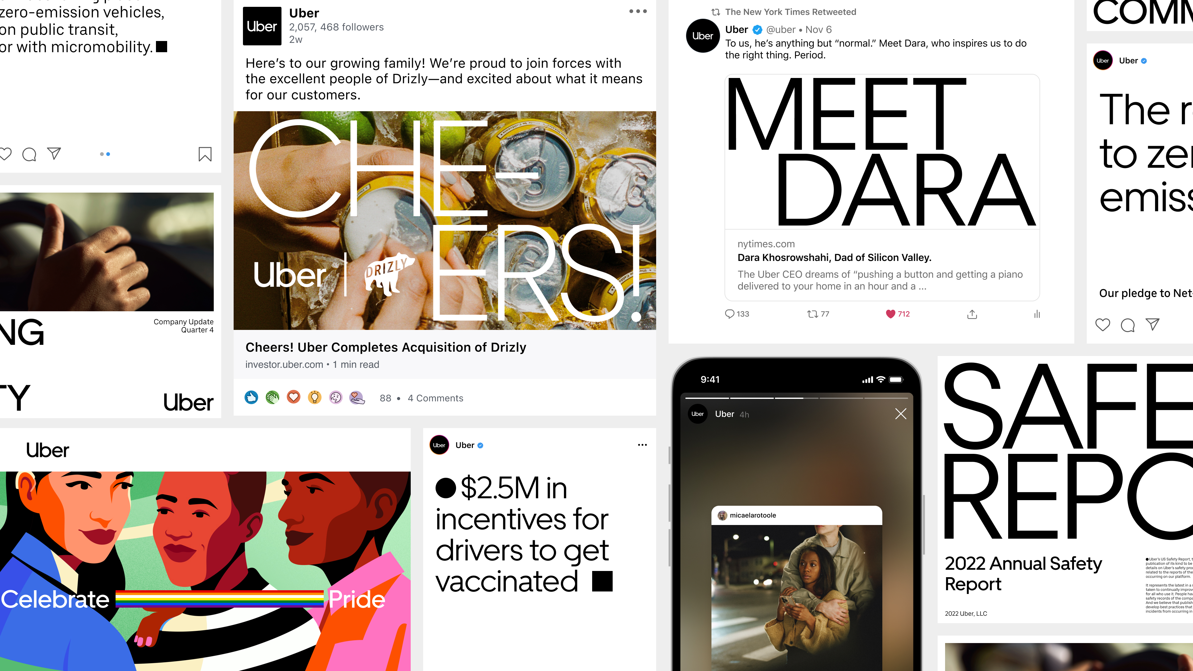
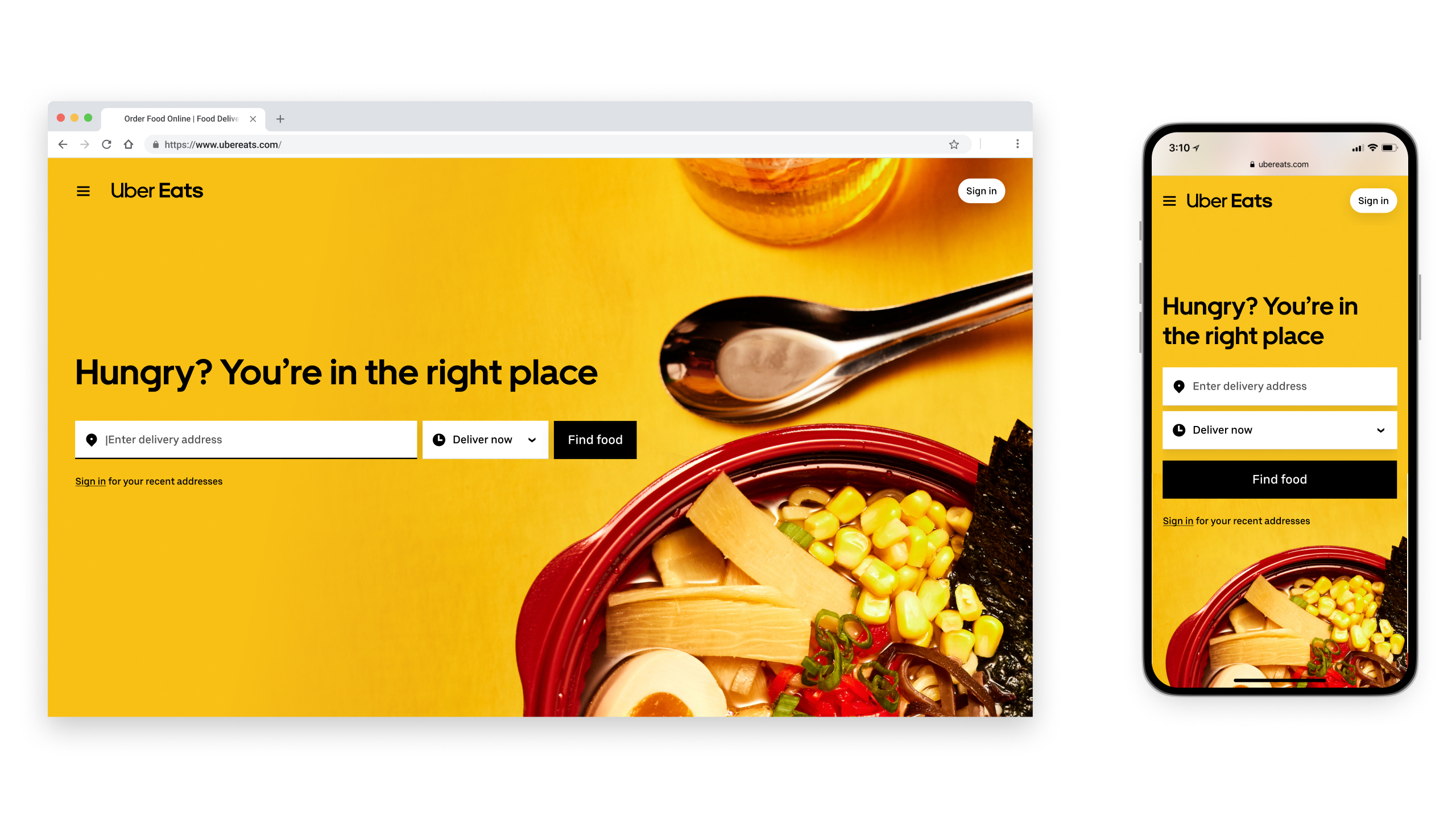
Research showed that the map UI was the only globally distinctive asset Uber owns. Other assets, like the color black, green, and Eats bags, were inconsistently applied across regions. This presented both a challenge and opportunity in building long-term brand equity.
Disparate brand efforts struggle to communicate a platform advantage.
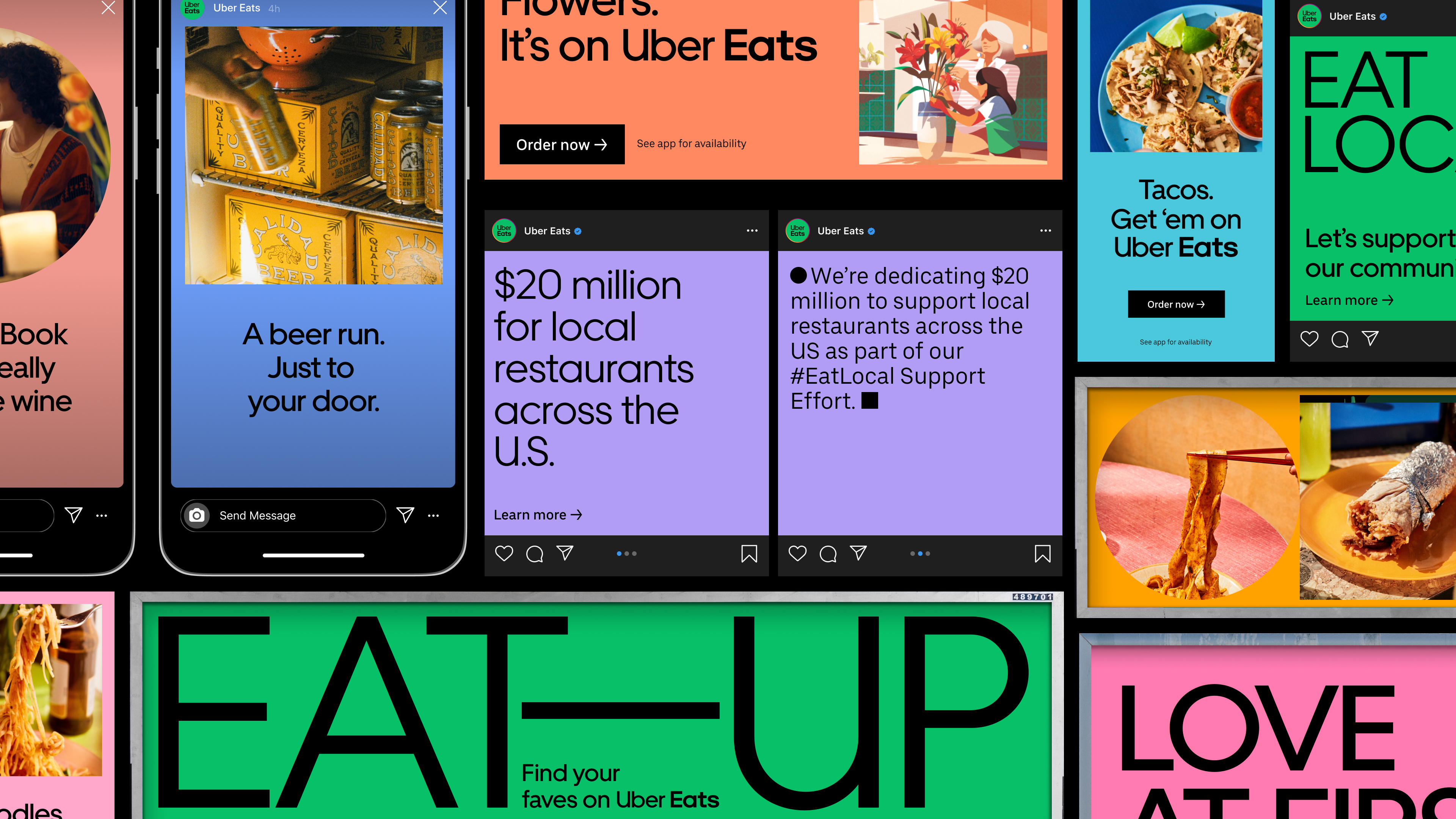
Despite Uber's shift towards a platform approach in which consumers can "go anywhere and get anything", Uber and Uber Eats remained disconnected, often competing for attention and inventing one-off brand assets.
As Uber's offerings commoditize, building brand loyalty becomes a priority.
Brand sentiment continues to be a challenge—consumers use Uber as a utility without any affinity or loyalty to the brand.
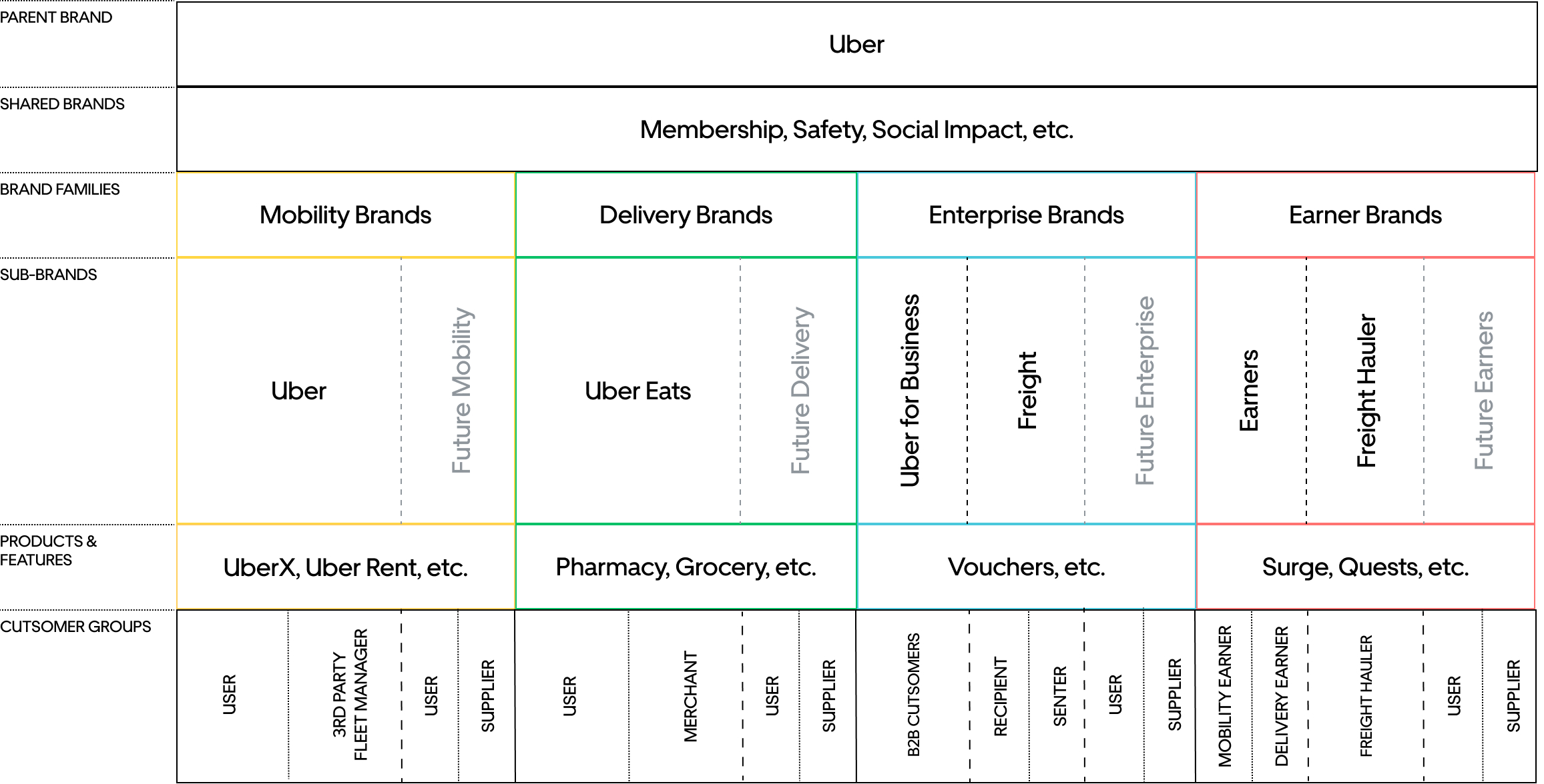
Aligning our brands.
A brand architecture defines how a brand shows up and interacts with users. For the first time in Uber's history, we built a holistic vision of the Uber brand and its ever-expanding portfolio of services. By defining our identity at the parent and brand family levels, we created a future-proof way to stay consistent with users as business needs and goals continue to evolve.
Parent brand.
Defining our identity.
Our Parent brand is what defines our identity and various behaviors. Once defined, we decide how it flexes based on audience, goals, and functional requirements.
Traditionally, Uber's Parent and Mobility brands have been one in the same. By detaching the two in our brand architecture, we created a more equal footing for all of Uber's offerings and a clear voice for more corporate based communications.

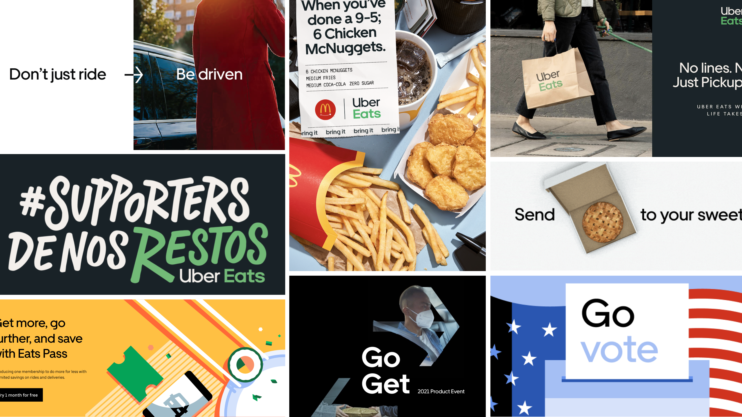
Mobility brands.
Maintaining distinctiveness and unlocking expression.
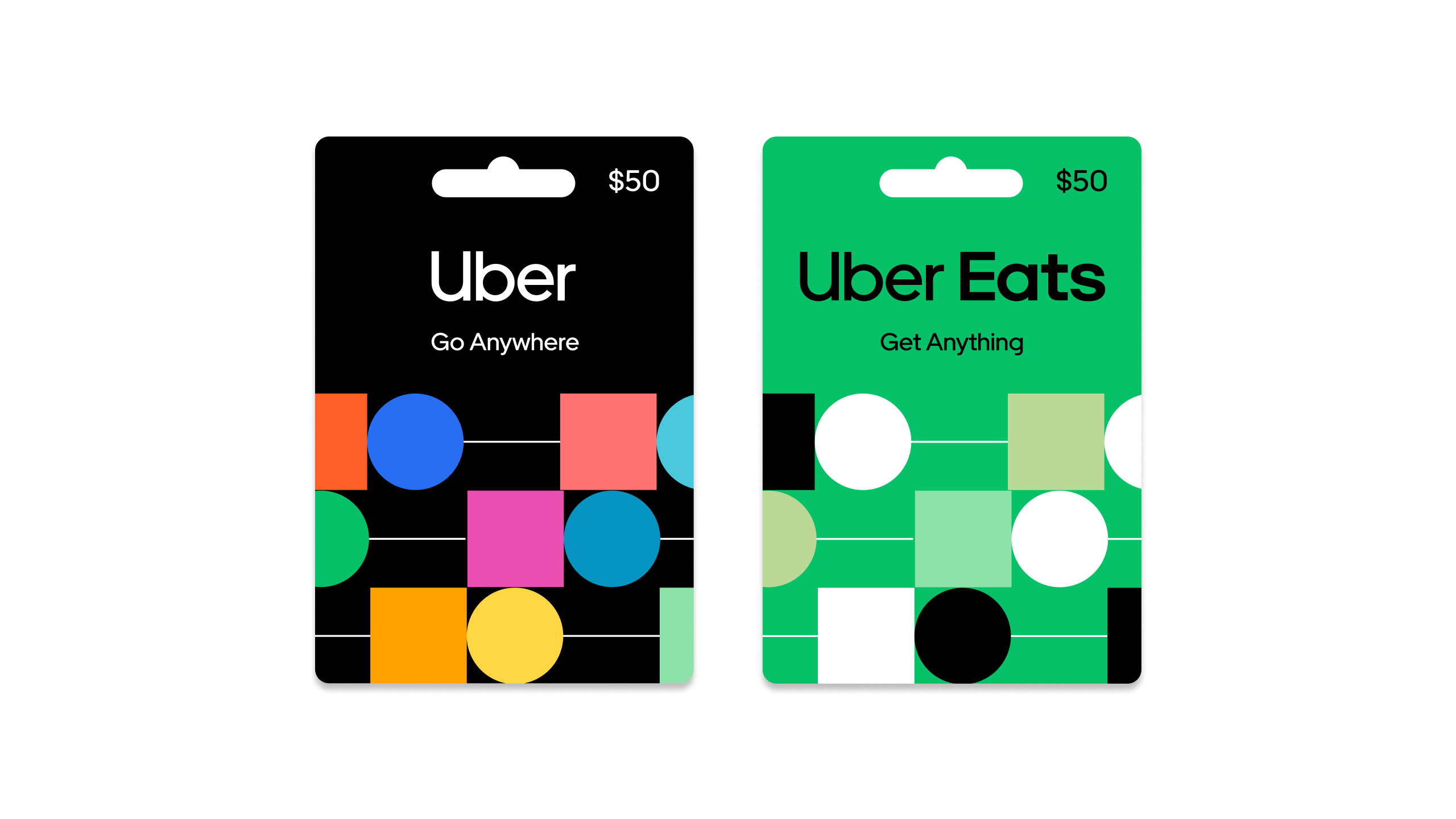
Uber's Mobility brand is its most well-known, with particular equity held in the color black. In order to continue to build that equity, our mobility brand shows up primarily with a black canvas. To better connect with audiences, white and colorful typography is used throughout.
Delivery brands.
Color inspired by content.
In moments of awareness, Delivery brands show up primarily as a green canvas with black typography as a connection to the Parent and Mobility brands. In owned channels and where building loyalty and engagement is more of a priority, we open up a world of color backgrounds to bring to life the promise of "Get Anything."
Building equity in green.
When evaluating the delivery competitive landscape and the need for Delivery brands to show up in complex physical spaces, we saw the opportunity to more strategically invest in green across every touchpoint possible. This gives our Delivery brands a unified set of assets all working together to build distinctiveness in green.
Reimagining movement.
With our new brand northstar, "Reimagine the way the world moves for the better", we bring the ideas of reimagination and movement through every aspect of the identity.

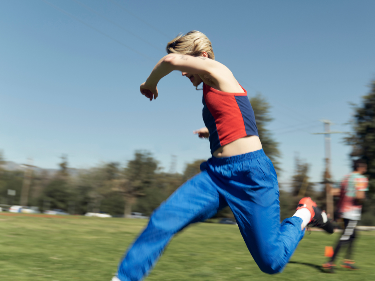
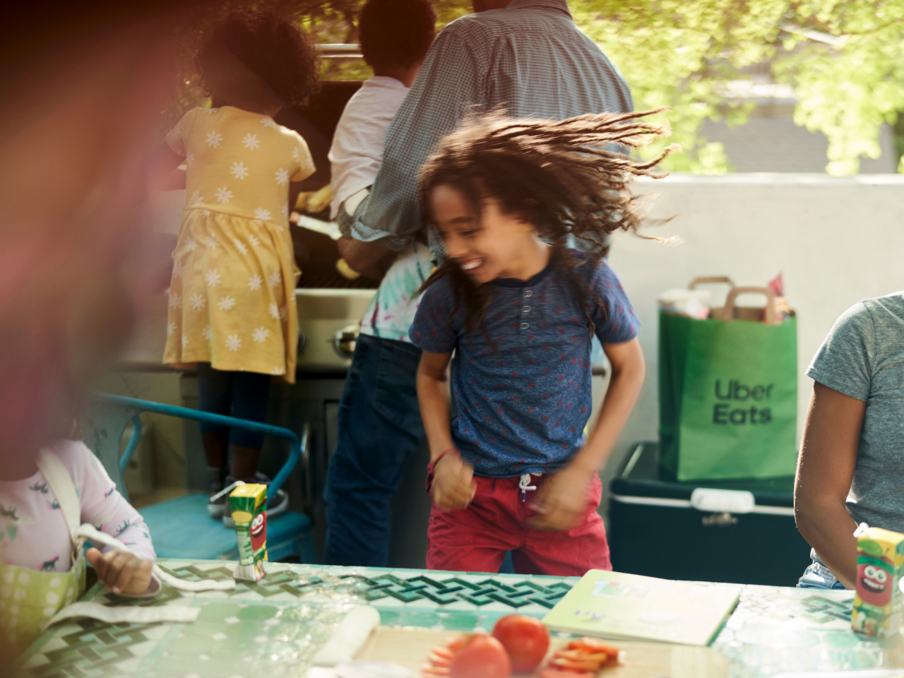
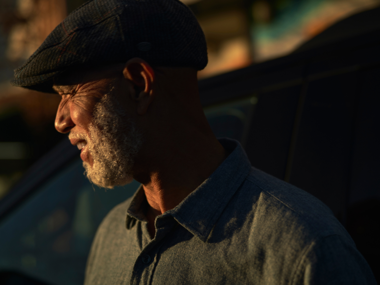
Movement in photography.
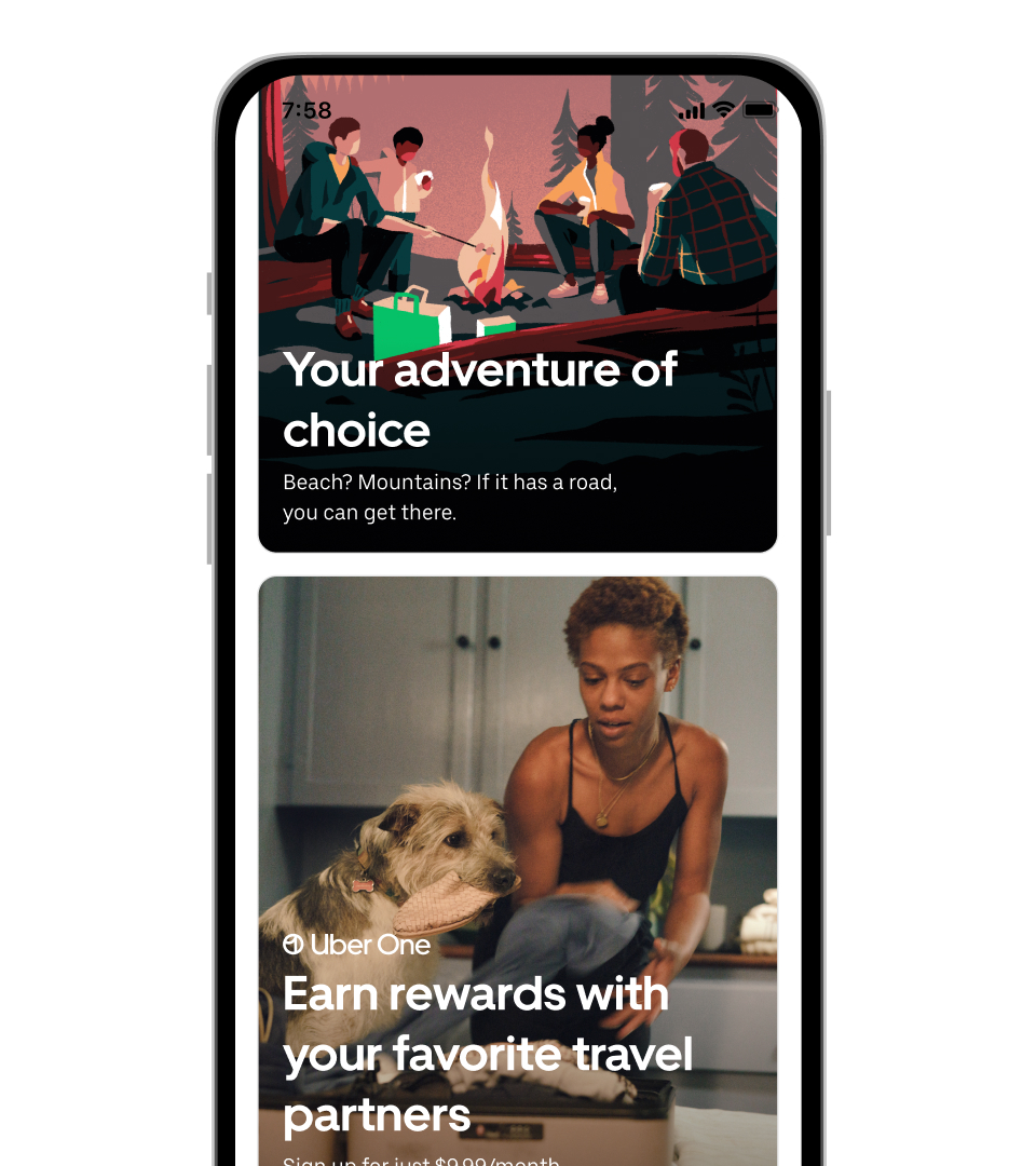
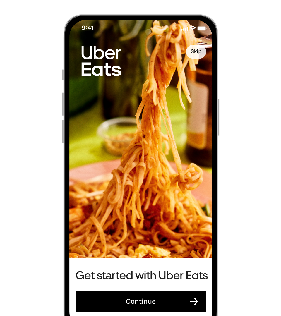
Movement is in Uber's DNA. We approach every photo with this in mind, creating a sense of movement whether literal or suggestive. Combined with a documentary-style art direction, our photography tells global, personally relevant stories through a clear narrative and sense of dynamism.
Form and figure.
Capturing movement at its most literal—through human figure or subject matter.

Illusion of movement.
Creating a sense of movement to come, before or after.
Through technique.
Reinforce a sense of movement through unexpected perspectives, dynamic use of light and shadow, and motion blur.
Moved emotionally.
Portraiture that captures an authentic moment of joy, pride, levity or otherwise to move viewers emotionally.
Movement in layout, hierarchy, and typography.
We developed an advanced layout grid to bring more movement to even the most basic of our compositions.
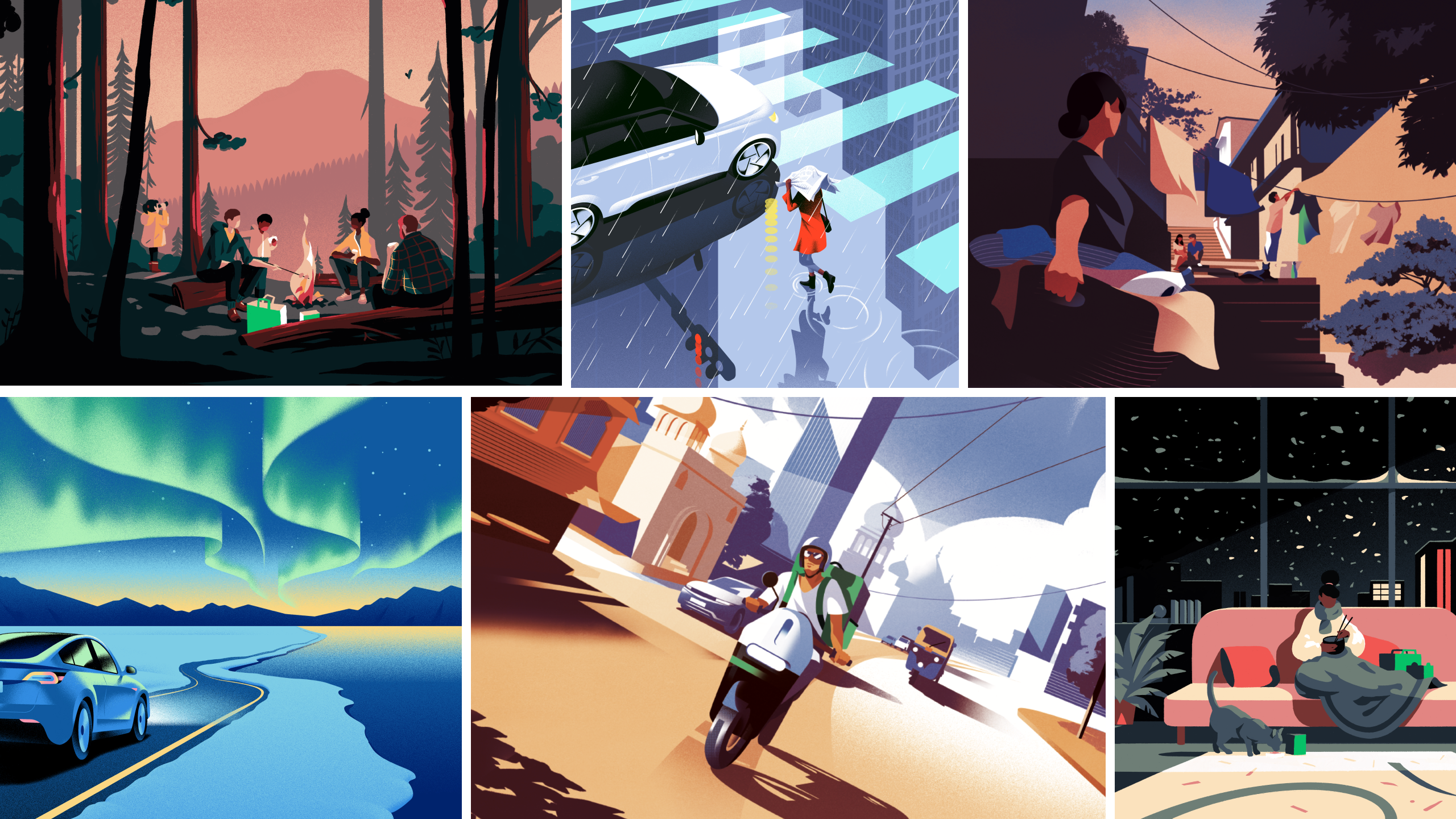
Reimagination in illustration.
We found an opportunity for illustration to contrast photography in its ability to depict the unreal, to inspire a sense of wonder, and to capture people, environments, and stories from across the world.
We developed a library with a set of principles, leaning in to the natural variance that occurs from one illustrator to another. Through this approach, we've created a family of illustrations that appear more as cousins rather than siblings, unified by dynamic perspective, motion, universal representation, and a strong presence of the color black.
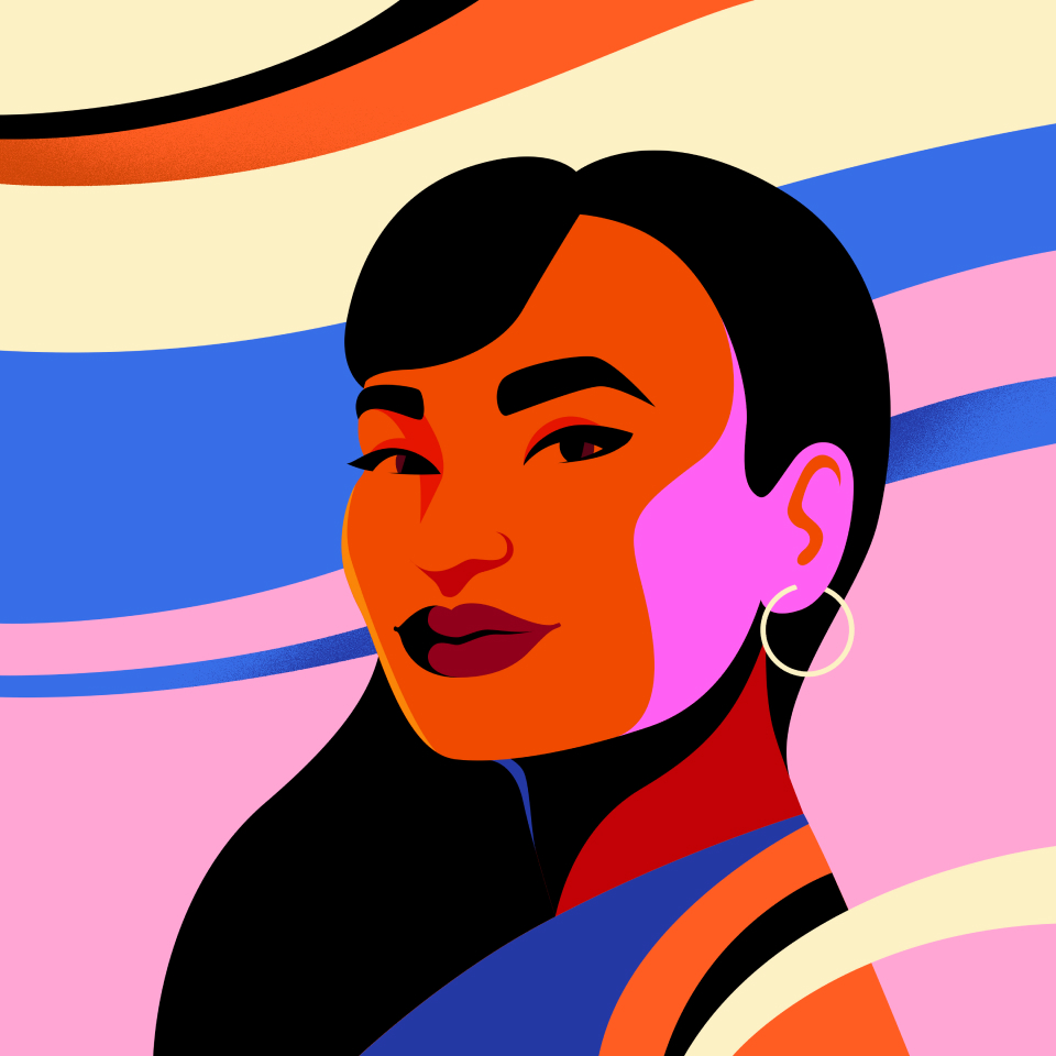
Color.
Bold colors, striking contrast, and a prominent use of the color black help to create a cohesive family of illustrations.
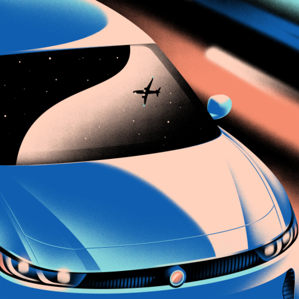
Dynamic perspective.
By utilizing dynamic and unexpected perspectives, we bring a sense of movement to compositions even when in static form.

Real environments, real people.
Our illustrations celebrate the cultural nuances of specific places and the unique personalities of each individual.
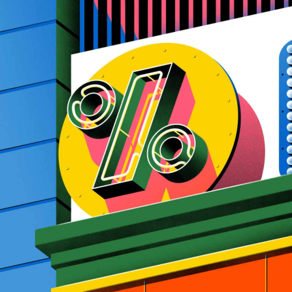
Metaphor and abstraction.
Our use of metaphor is still grounded in everyday life.
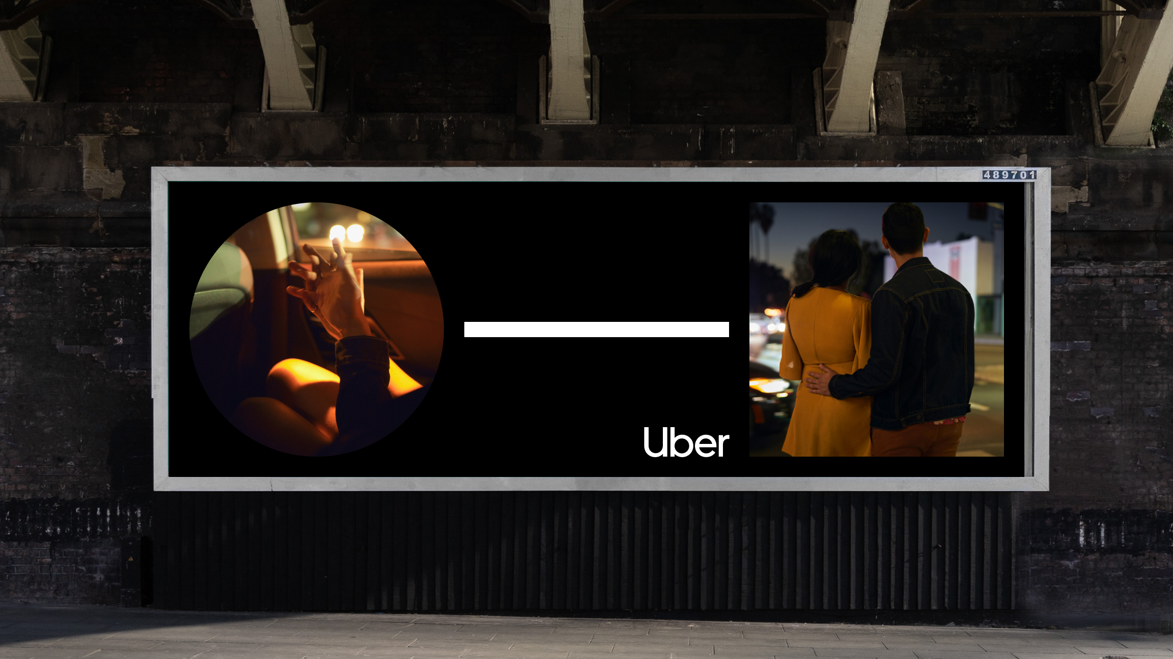
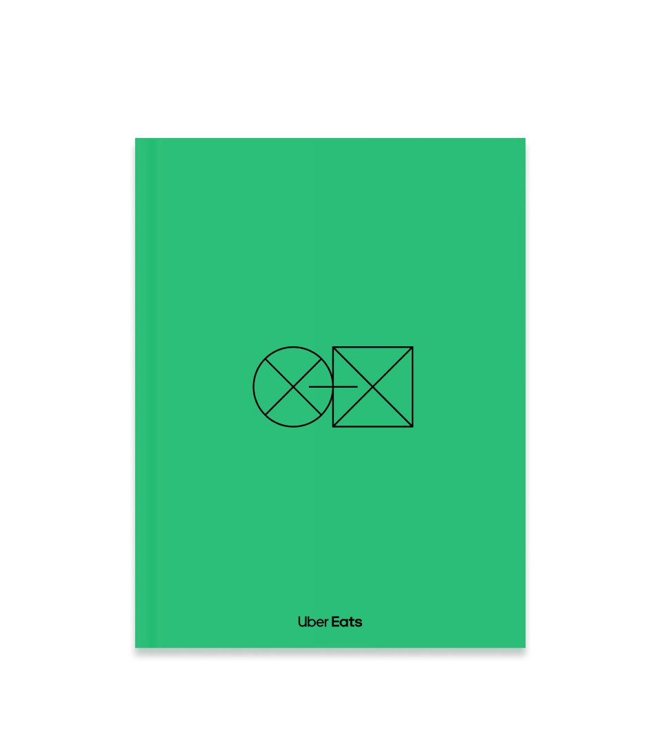
The Journey: investing in what makes us uniquely Uber.
Building distinctive assets requires a cross-functional effort. We found inspiration in our product experience and turned one of our most recognizable functional assets into a conceptual storytelling device for marketing.
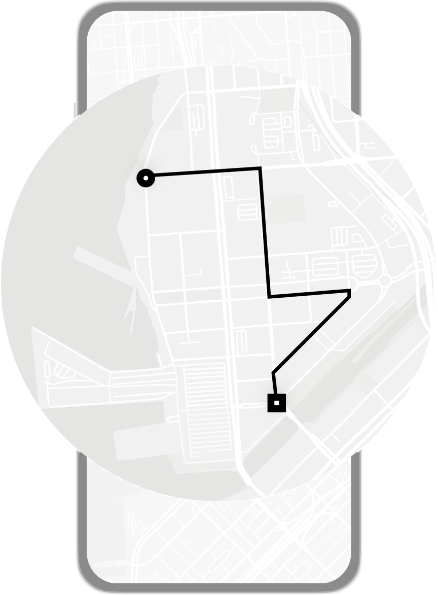

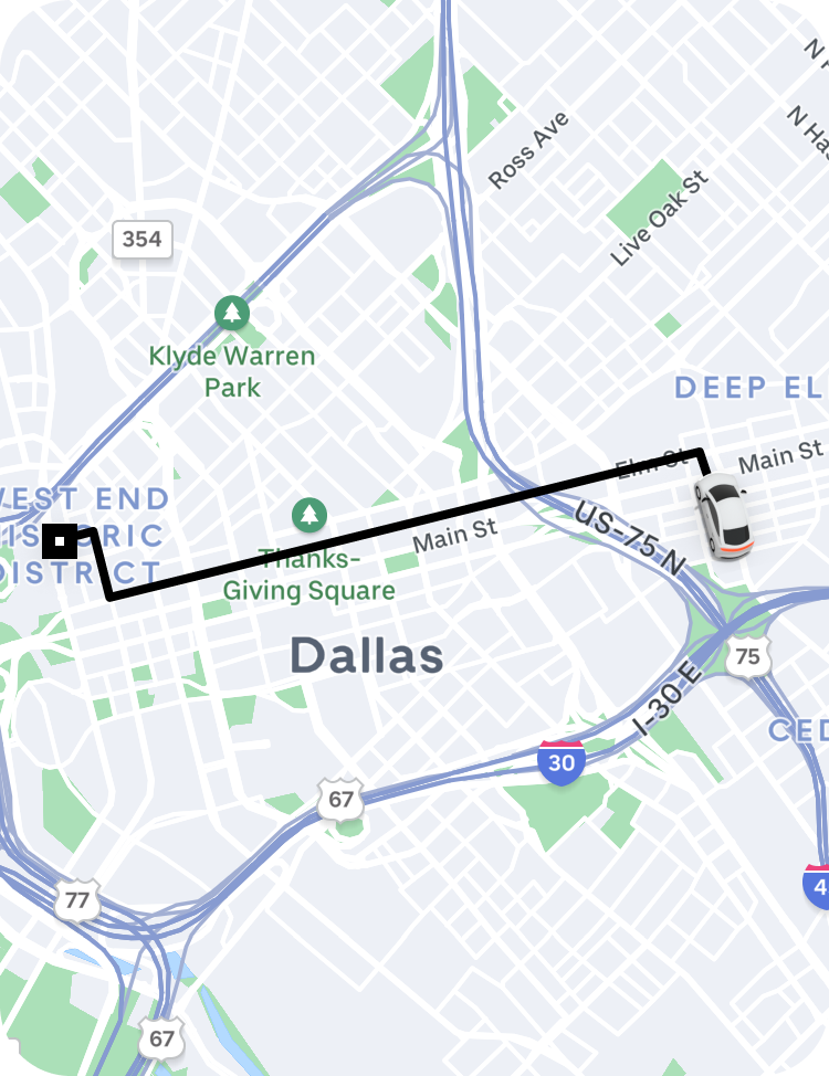
Circle.
The beginning of a journey.

Line.
The connections we create for our users.

Square.
The end of a journey.
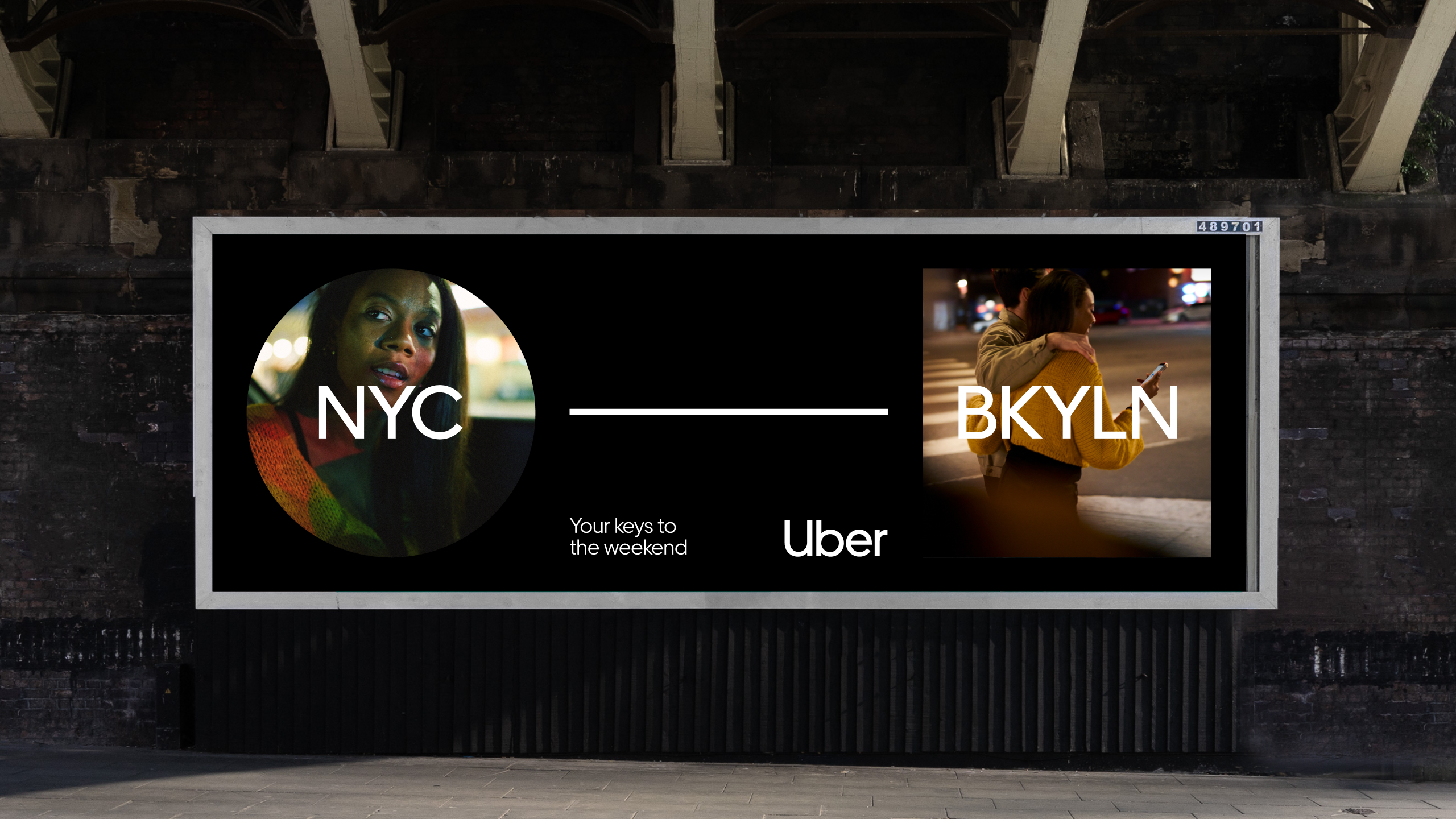
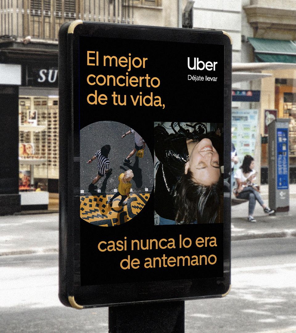
Connecting people.
By connecting people to other people, we can tell emotional stories in surprisingly simple ways.

Connecting locations.
By connecting places, we can tell the stories of a journey made possible by Uber or even the stories of a city itself.
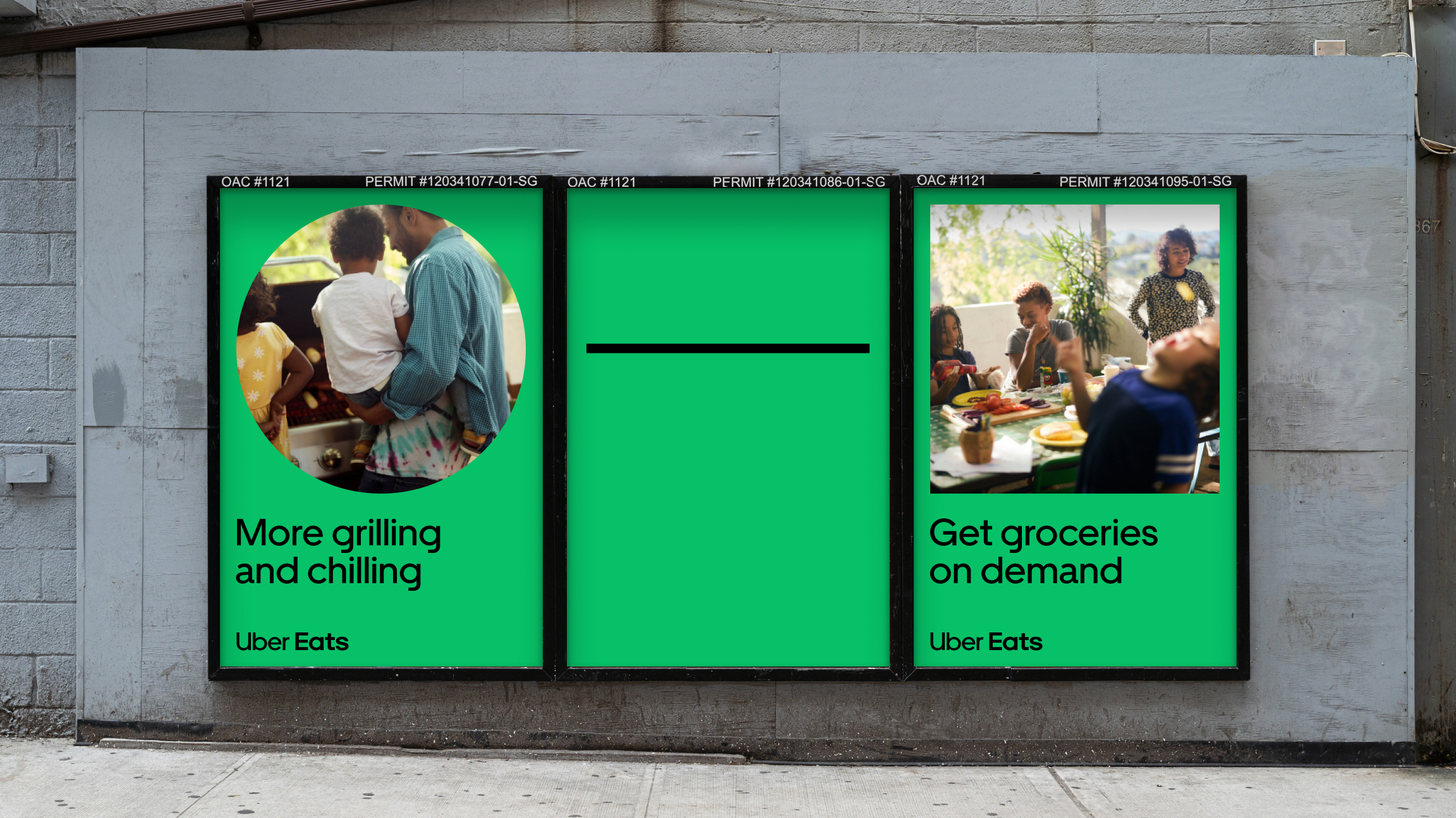
Unlocking experiences.
By connecting now and later, we can tell stories about the experiences Uber unlocks.

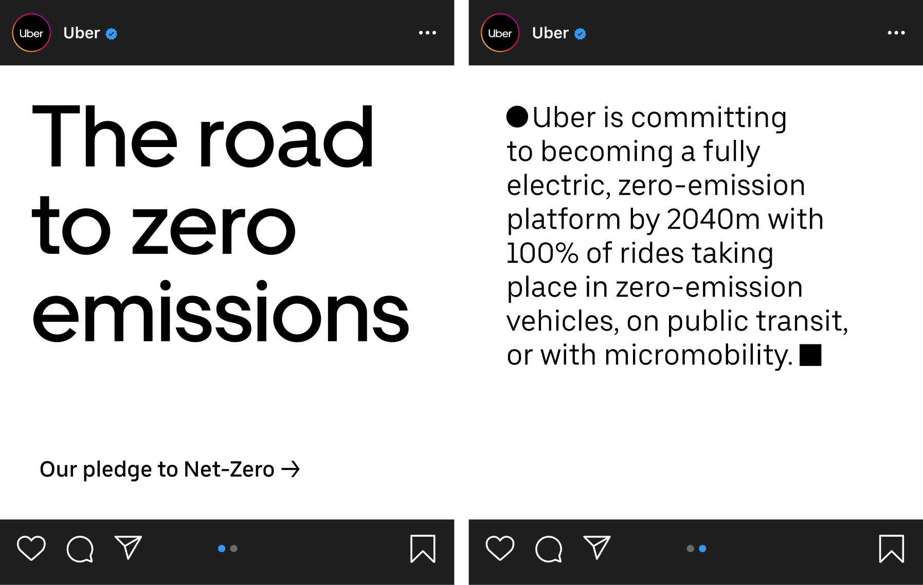
Calls to action and benefits.
We can create calls to action and clear product benefit stories that inspire people to chase new and exciting possibilities.
A flexible framework for any message.
The Journey flexes to feel distinctively Uber even when making a simple, bold statement.


brand
Creative Direction
Dan Schwer
Brand Design
Ryan Howard, Mariclare Rethore, & Erin Wallace
Illustration
Alyssa Foote (AD), Charlie Davis, Petra Eriksson, Tom Haugomat & Michele Marconi
Copywriting
Dirk Hunter
Brand Managers
Shauna Derby, Max Hollander & Molly Reynolds
Program Managers
Jenise Fritz & Leah Letcher
jones knowles ritchie