Rippling brand identity evolution.
With the launch of a new suite of spend products and an ambitious plan for global expansion, Rippling began to shift from an audience of small and mid-sized businesses to large scale enterprises.
In order to position Rippling as a powerful and premium solution capable of handling enterprise needs, the Rippling Brand Studio team reimagined nearly every facet of the brand while keeping sacred a few distinctive elements.
Vision
The platform uniquely built to empower your people.
Develop a brand identity and creative platform that positions Rippling as an enterprise-grade, paradigm-shifting, all-in-one solution.
Goals
Focus on outcomes.
Shift messaging from product features to emotional and organizational benefits.
Develop brand foundations.
Speed up time to creation and prepare Rippling to become a world-class brand with a more complete and cohesive identity.
Build brand awareness.
Ensure the identity supports and reinforces an investment in a few key distinctive assets.
An extremely distinctive color palette.
Rippling's color palette is not only competitively differentiated, it's so distinct that customers, prospects, and candidates alike all tend to comment on it. Love it or hate it, the plum and yellow palette is incredibly memorable, making it an invaluable asset for a brand striving for awareness.
Too playful for enterprise.
The brand identity as it existed pre-2022 was successfully designed to resonate with small and mid-sized businesses. However, the hand-drawn illustrations and magic-inspired messaging wasn’t resonating with enterprise audiences.
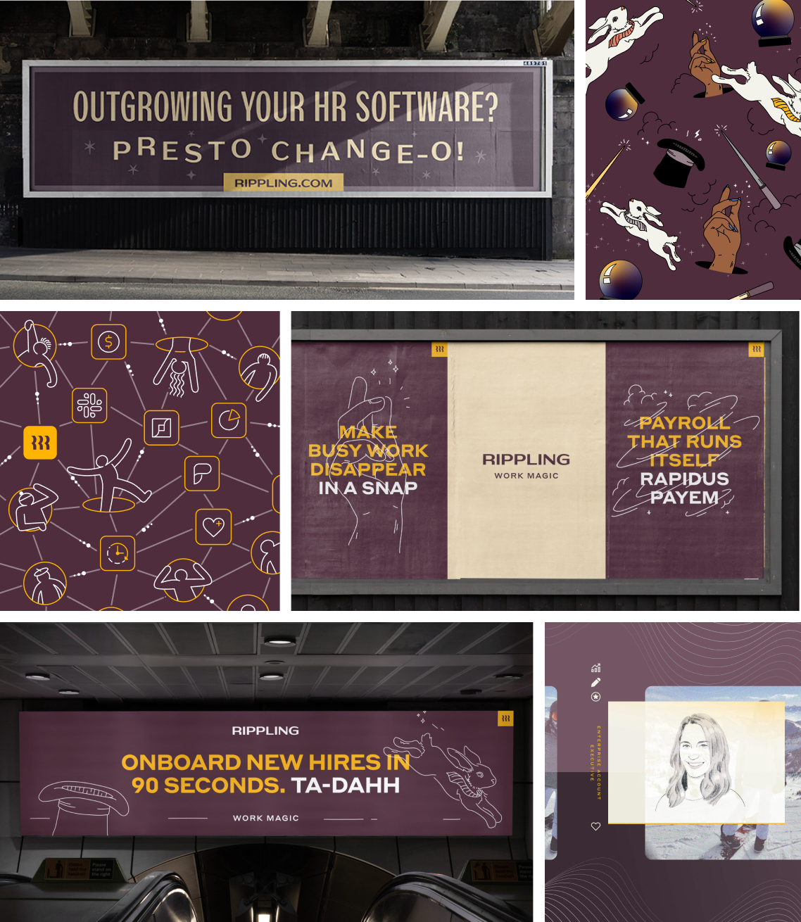
The Rippling effect: a brand platform inspired by outcomes.
While it serves as a catchy tag line, the Rippling effect as a platform is about turning every individual, team, and department into an empowered one, capable of making broad institutional impact within their organization. This represents a profound change in the way Rippling approaches marketing—from a focus on product features ("90 second onboarding") to brand messaging ("When HR makes an impact").
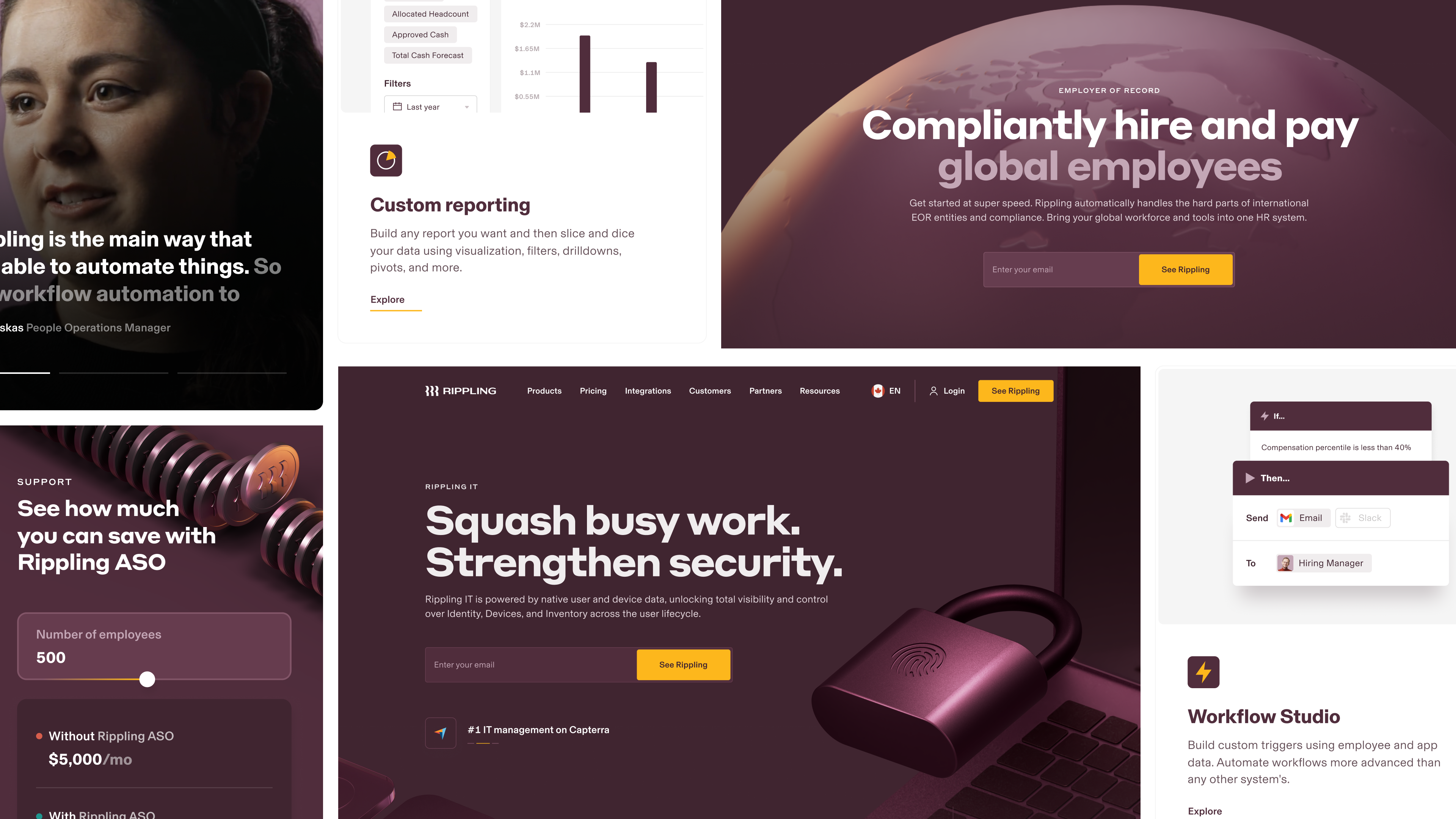
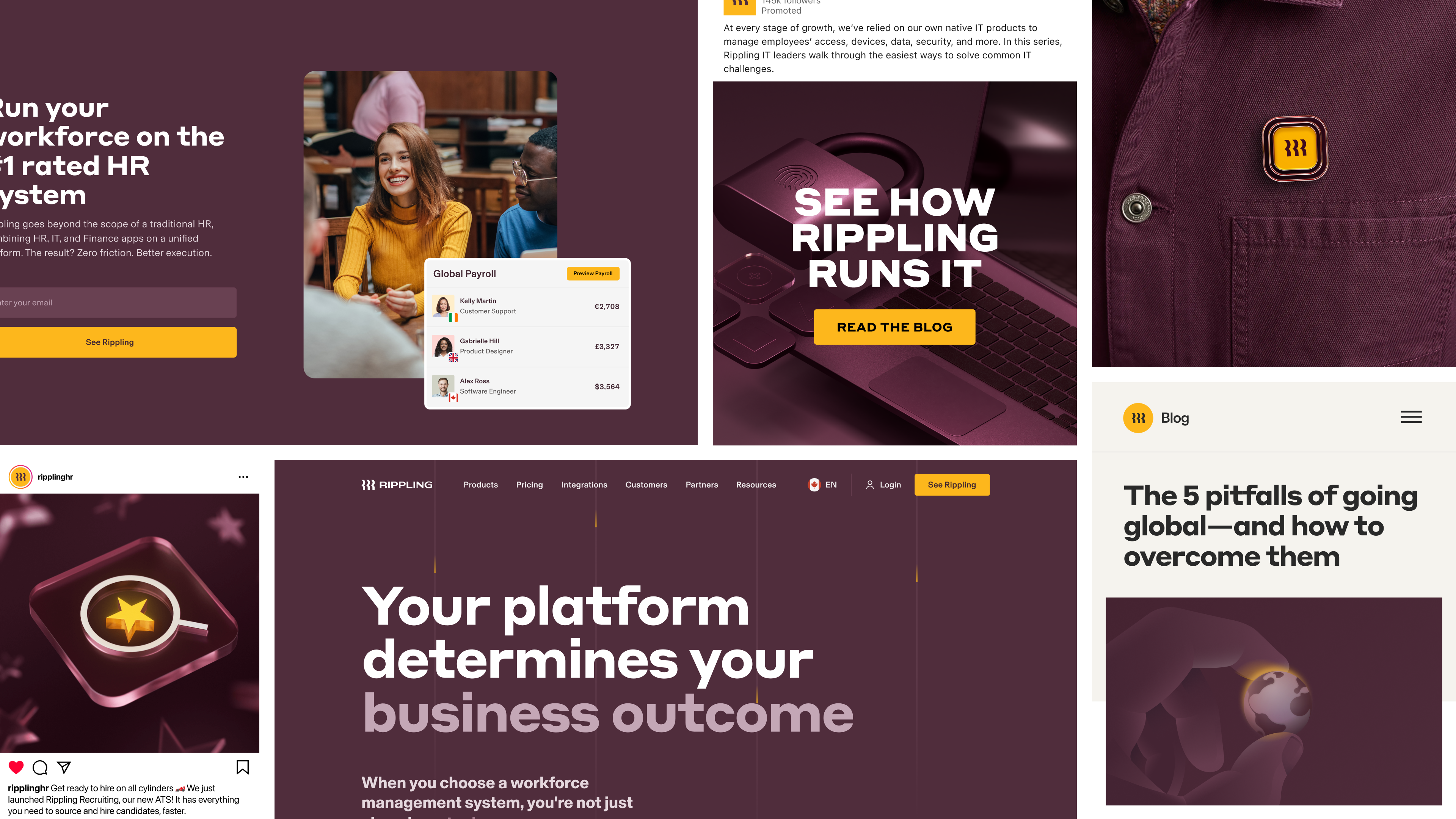
Bringing impact to the web.
Developed in tandem with the identity, the web design team rebuilt nearly every component and module on the marketing site to enable bolder messaging, more dramatic imagery, and easier-to-understand static and animated product representations.
Elevating the voice of our customer.
We developed a brand identity and customer testimonial videos for Wavemakers, a first-of-its-kind program celebrating Rippling admins who make an outsized impact on their organization. Our goal was to hero the customer experience while also positioning Wavemakers as trailblazers within their industry.
Building the foundations of the brand identity.
While the brand that existed before 2022 had many positive elements, much of it wasn't formalized or documented, and some key components were missing altogether (e.g., photography). We set out to rebuild the existing elements, fill in the gaps, prepare Rippling for global expansion, and enable us to effectively speak to an enterprise audience.
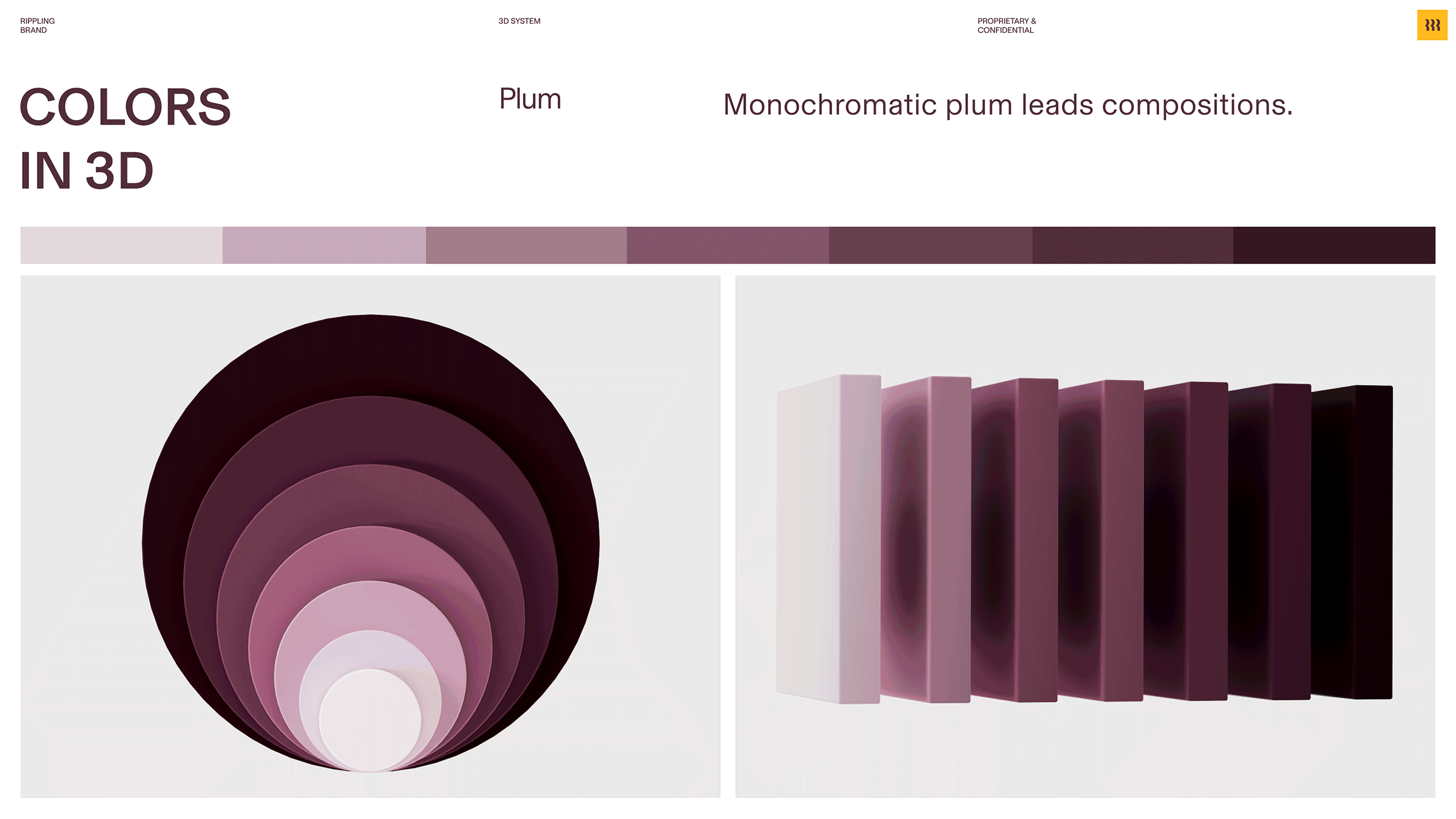
Sharpening our approach to 3D.
We developed a 3D system with a refined set of premium materials, and an even smaller set of colors to ensure we continued to build brand equity into our distinctive color palette at every touchpoint.

A hard-working illustration style inspired by 3D.
While 3D serves as the graphic hero of the brand, illustration supports all the different types of metaphorical and literal messaging Rippling requires (e.g. "PEO renewal rates you can trust"). The isometric style and limited color palette provides a consistent and reusable framework for quick execution that always nails the brief.
Illustrated icons bring a playful wink.
We created an expressive set of icons visually inspired by our 3D and 2D illustration styles with the intent to bring an elevated touch of playfulness to our product, sales materials, and on the web.

Introducing photography to the brand.
Rippling's distinctive palette demanded a color-first approach to defining photography. Warm, wood environments harmonize with Rippling's plum while pops of unexpected vibrancy in wardrobe match the use of yellow in the brand language.
brand STUDIO
Creative Direction
Dan Schwer
Brand Design & Art Direction
Greer Chapman, Pat Iadanza, Owobu Ijewere, Jess Ruggierio
Web Design
Amanda Buzard, Ian Dickens, River Marchand, Tim Gilligan, Voja Vitkovac, Ilija Vujinovic
3D & Motion Design
Ben Chwirka
Copywriting
Parker Tarun, Colin Spencer, Nnamdi Oghedo, Amy Moon
Marketing Managers
Sam Harvey Fachiol, Josh Hornthal, Emmy Quinn, Sam Resnick, Erin McInrue Savage, Evan Zhang
Program Managers
Bri Ivar, Jane Nagle, Molly Otto, Rebecca Pustizzi
PARTNERS