Zelle.
Zelle is backed by America's largest banks to provide a peer to peer payment product to compete in speed, security, and experience.
As lead designer, I worked hands-on in partnership with our UX lead to design the core experience, onboarding, settings, and edge states across iOS and web. In parallel, I directed the work of a production designer working on the Android version.
After we completed design of the MVP, my role shifted to oversight and direction as the brand, marketing site, partnership integration, and further refinements to the product took shape.
Vision
Create the first real-time, anyone-to-anyone, secure payment system.
Goals
Speed.
I can send money instantly.
Reach.
I can send money to anyone.
Target demographics.
Cash-free digital natives.
Key influencer pool to drive adoption. Represents the highest bar for entry to market.
Values ubiquity, seamless utility, and speed.
P2P skeptics.
Large up-funnel user base, especially within existing bank "captive audiences."
Values ease of use and security.
Defining our roadmap.
In partnership with the Zelle product and engineering teams, we developed a roadmap of features to ground our ideation while keeping an eye towards the future vision.
MVP.
Real time payments.
In network payments.
Split the bill.
Activity tracking.
Gen 01.
Achieving ubiquity.
Extend network of banks.
Recurring payments.
Personal payment page.
View account balances.
Gen 02.
Excite and empower.
Open tab.
Anticipatory notifications.
Zelle keyboard app.
P2P & P2B.
North Star.
Fully differentiated.
Open tab with businesses.
Contextual financial tips.
International payments.
Web checkout.
Timeline.
User research and strategy was performed in advance of designing the MVP. Once our strategy was locked, we worked in two-week sprints with two rounds of user testing.

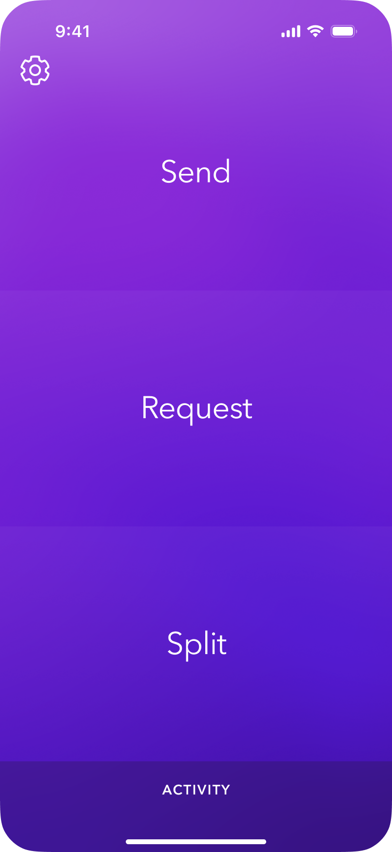
Speed and ease of use, visualized.
Based on the key drivers found in user research, we created the landing experience with the most basic simplicity in mind. No social features, just get in and out as quickly as possible. This also allowed us to put Zelle's most differentiated feature, splitting a bill, front and center.
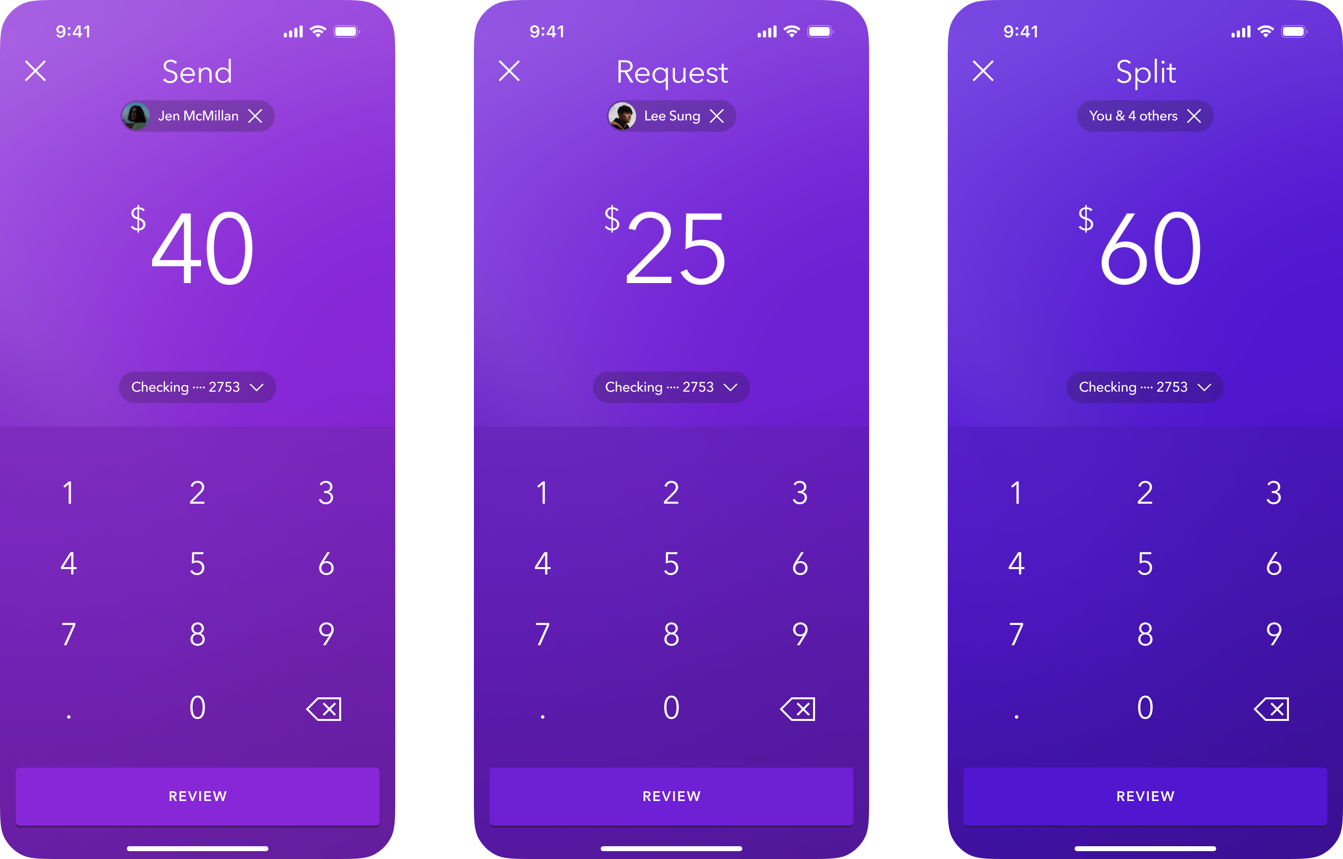
A consistent experience.
To create a seamless, fast, and easy to use experience, we designed each flow to start and end the exact same way, thus creating less cognitive load for regular users.
Did it really send that fast?
Our original flow lacked some of the artificial blockers present in our final design (shown here). When we brought it to user testing, users were so unaccustomed to being able to send money instantaneously that they didn't believe the transaction went through. To compensate, we added an "All Done" button, forcing users to acknowledge that the transaction had gone through.
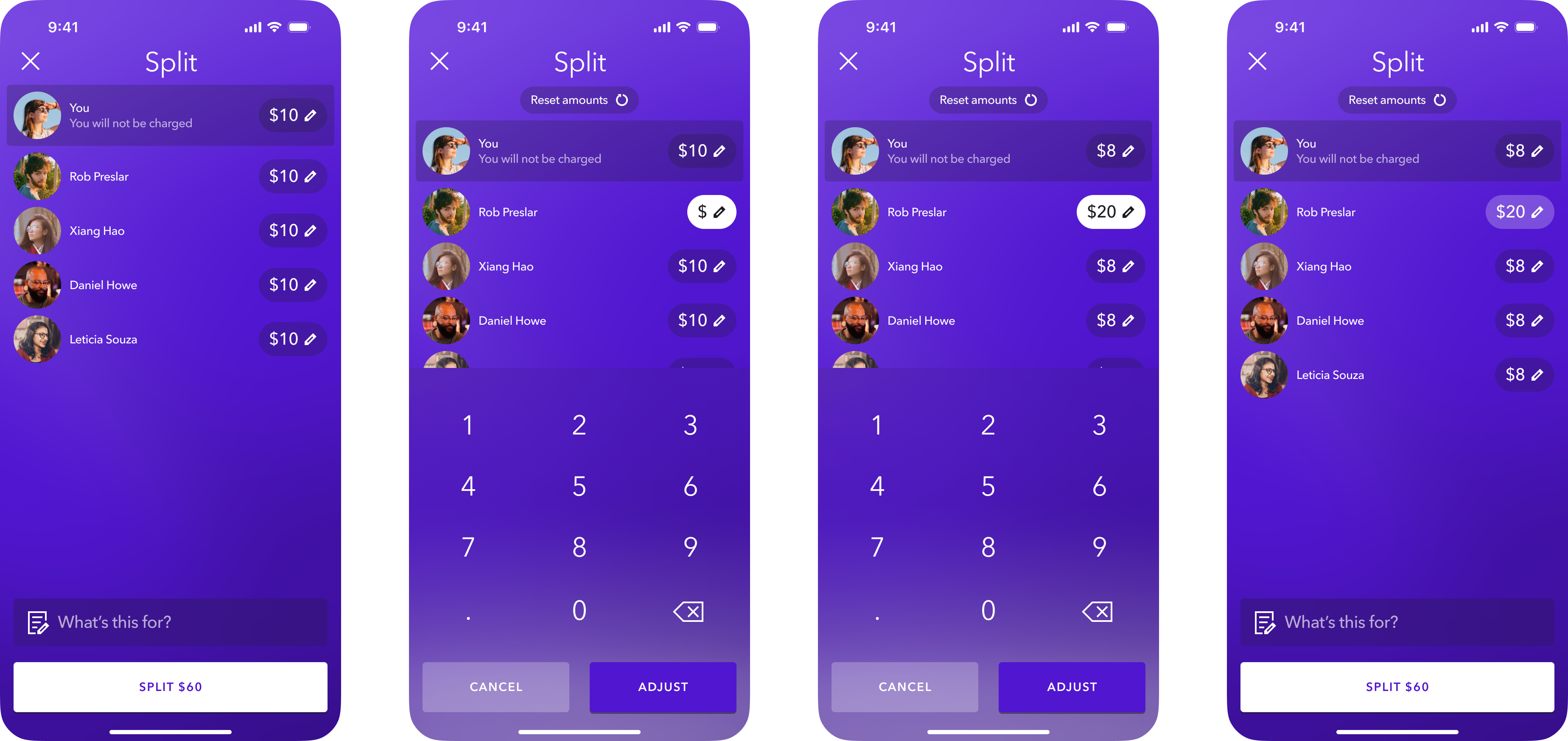
Put the calculator away.
When it comes to splitting the bill, there's a lot of math. We designed Zelle to auto-calculate totals as users enter in unique amounts for each individual.
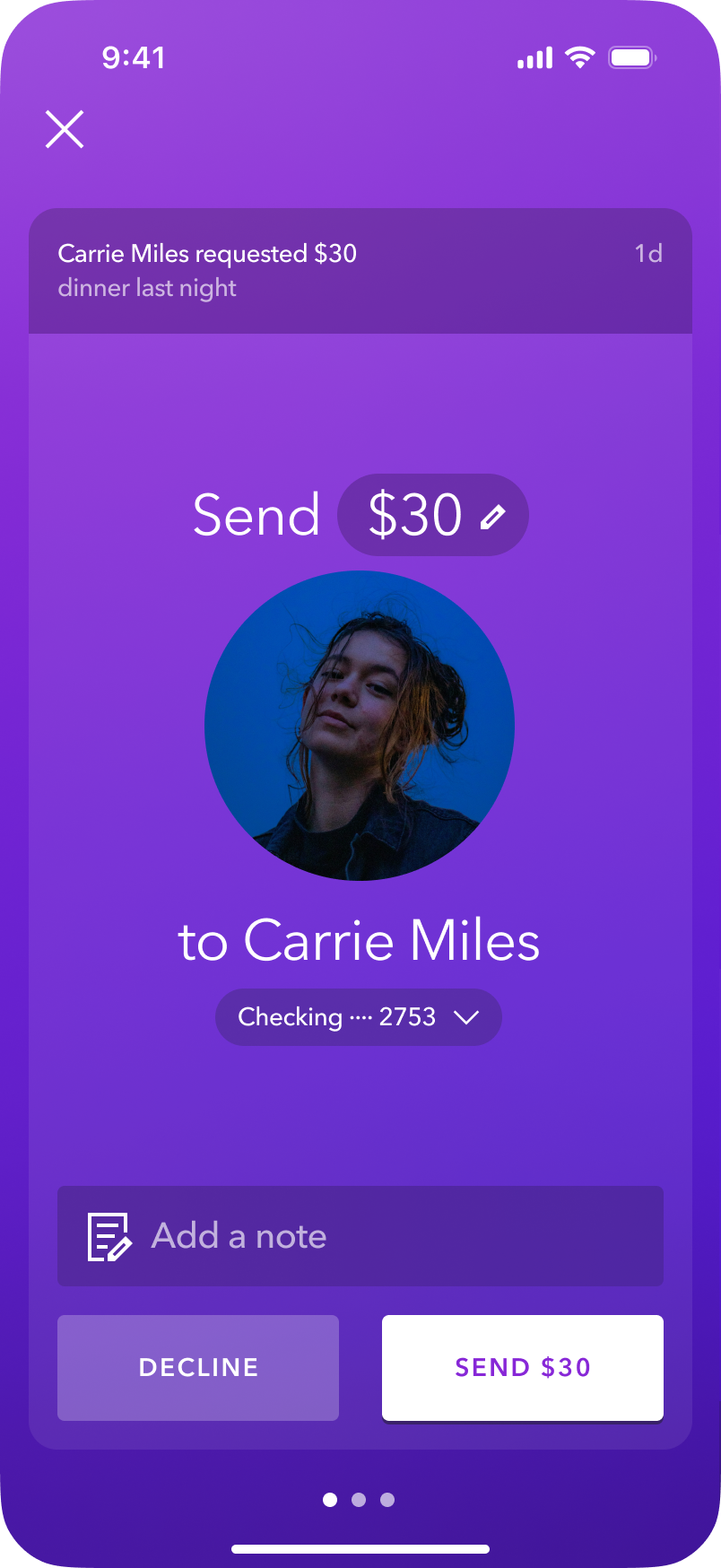
Taking the awkward out of asking for money.
We designed new requests as an interruptive experience in-app, so requesters aren't waiting for days for a response. Whether users have an account or not, they're able to send money via app or web.
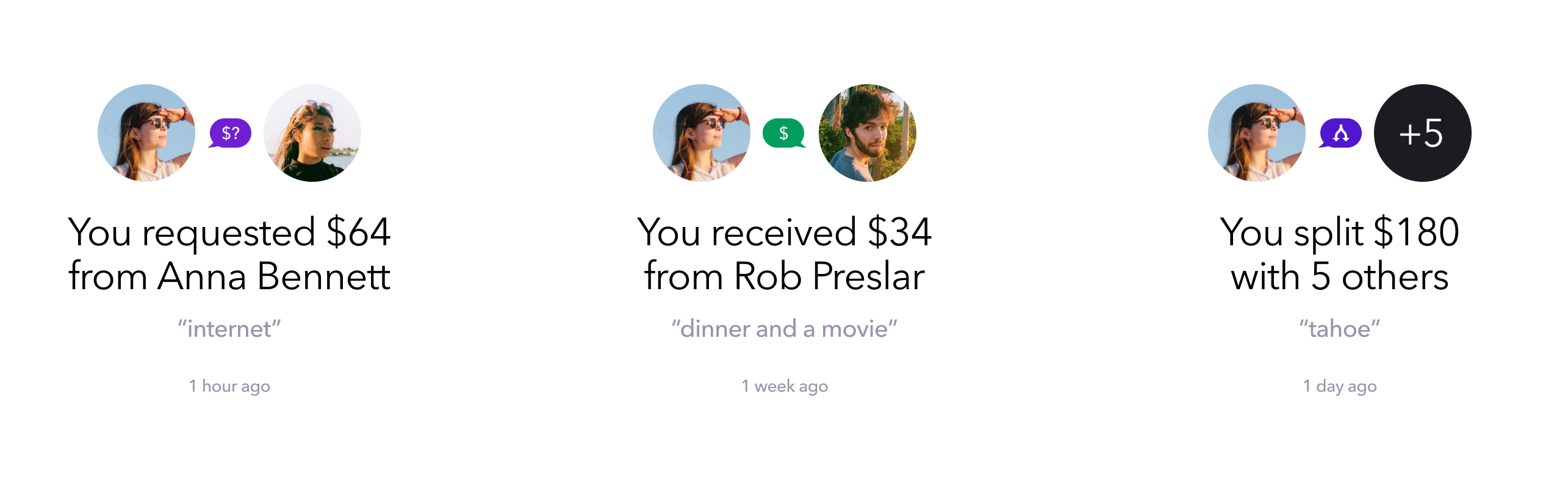
Consistent language and clear iconography.
We wanted to ensure that we used a consistent linguistic framework across 16 types of activity that prioritized a clear relationship between requestee/requestor and the status of the request. Once we nailed the framework, we reinforced the relationship with a visual language utilizing profile pictures and iconography for at-a-glance readability.
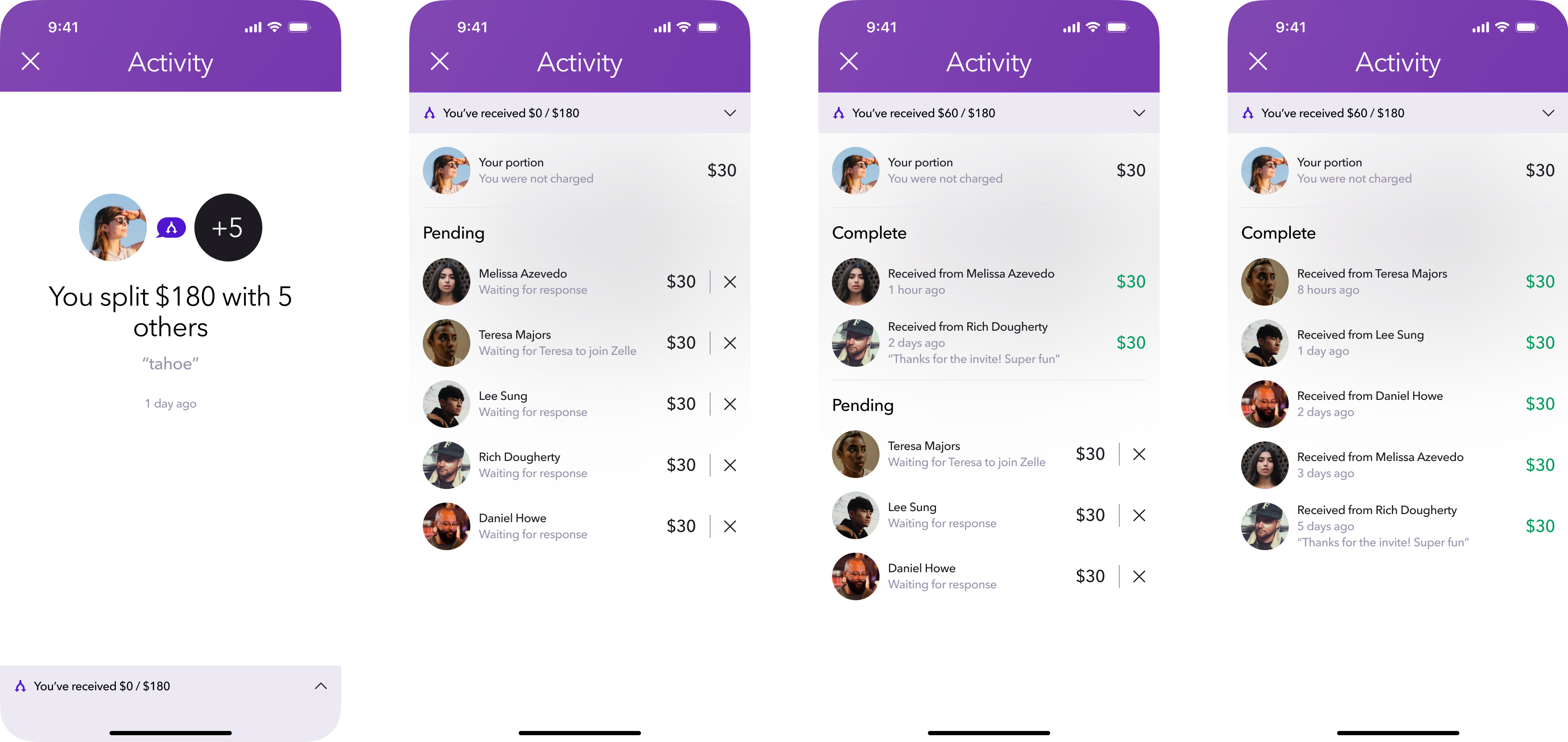
Who's paid me?
Once a split is sent out, it can be challenging to track who's paid and who's slow to respond. Zelle let's users know where each individual stands and includees controls to cancel when cash is involved.
Speed and reach across web, iOS, Android, and even text.
Knowing the importance of achieving ubiquity, we developed Zelle for all major platforms, including the ability to send and request money via text.
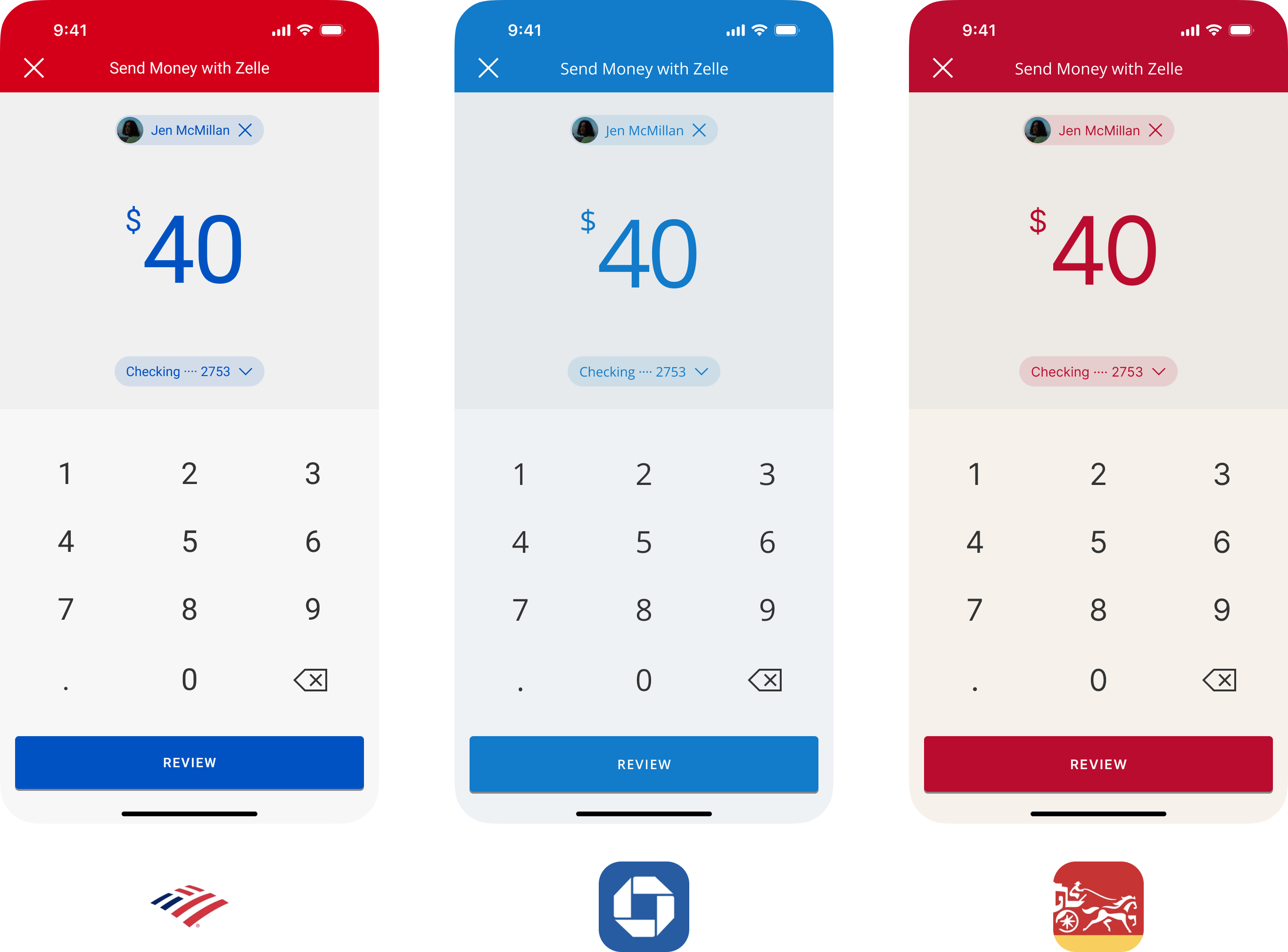
Extending the experience to partner banks.
Once the core experience was defined, I provided direction to the Huge team in LA as they developed guidelines for partner integration. Our brand strategy was to develop Zelle as its own, branded, standalone experience. This led us to advocate for a skinned version of the design that would build equity and consistency anywhere Zelle appeared. The core experience was later patented.
Results.
Over 8,000 financial institutions in network (up from seven at project kick off).
392M transactions in Q1 2021.
$106B transferred in Q1 2021, a 61% increase YoY.
huge
Creative Direction
Mike Dillingham
UX Direction
Jennie Perri
Technology Director
Marc Ammann
Design Lead
Dan Schwer
UX Lead
Joan Winter
Visual Design
Adin Kann
Interaction Design
Amanda Digiammarino
Production Design
Jorge Garcia
Software Engineer
Anton Doudarev
Product Management
Alec Simonson & Elina Simonetou
QA
Zo Guthrie
Zelle