Rippling website evolution.
Rippling has experienced unprecedented amounts of growth. Introducing new suites of products, pursuing new audience segments, and expanding globally. While at Rippling, I oversaw the growth of the marketing site, building a more scalable system to meet the many demands of a fast-growing organization. From overhauling our high-level brand message to operationalizing our localization process, we've built a web experience that's ready for Rippling's next phase of growth.
Vision
Your platform determines your outcome.
Goals
Update messaging.
Align to our brand platform.
Modernize and future-proof.
Build a web design system.
Scale content.
Create a robust content engine.
Go international.
Develop a localization process.
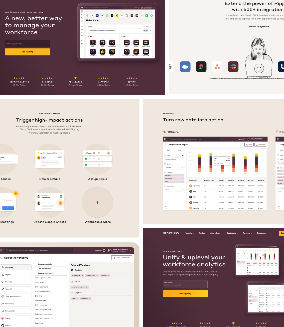
A foundation that needed updating and future-proofing.
The team had built a scrappy design system that was already showing its age. Flat value props, overcomplicated product visuals, and cutesy illustrations were just a few of the issues holding Rippling back from moving upmarket and bringing a new brand platform to life. Additionally, developers were custom building everything—even when blocks were being reused.
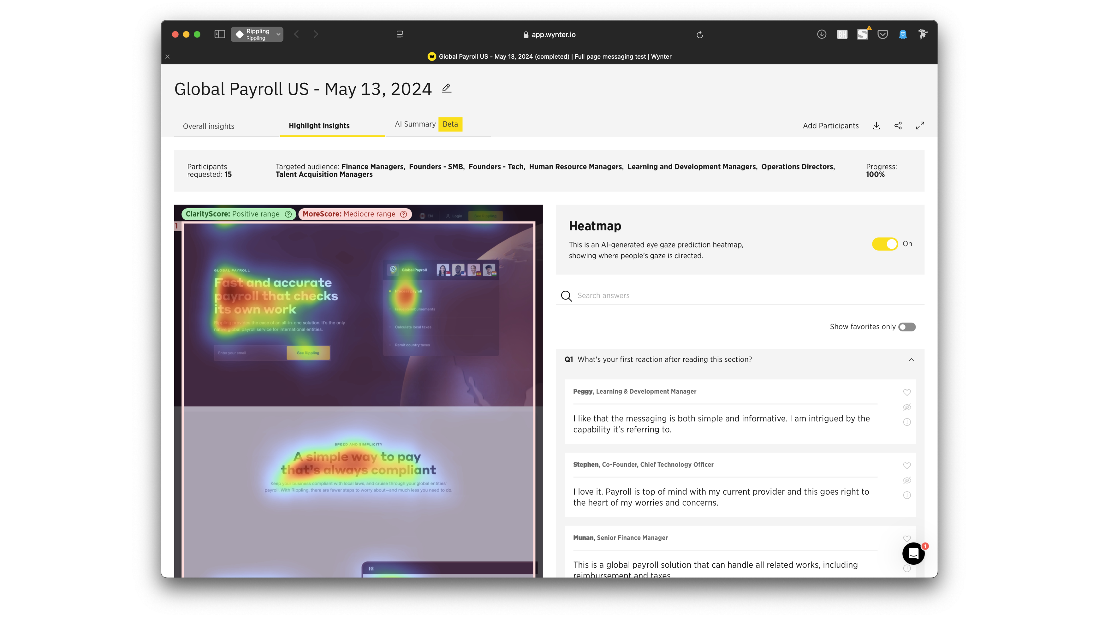
Introducing user testing into our process.
When I joined Rippling, the team lacked a CRO lead, had limited access to Google Analytics, and zero user insights or means of experimentation outside of paid LPs. The team began qualitative user testing before the launch of every page which helped refine individual pages while informing our broader approach to messaging and design.
Defining our differentiator.
In partnership with the COO, we developed a Platform page that's part manifesto and part a clear articulation of why Rippling is different. Most importantly, it stresses how the seemingly innocuous choice of software can determine a business's outcome.
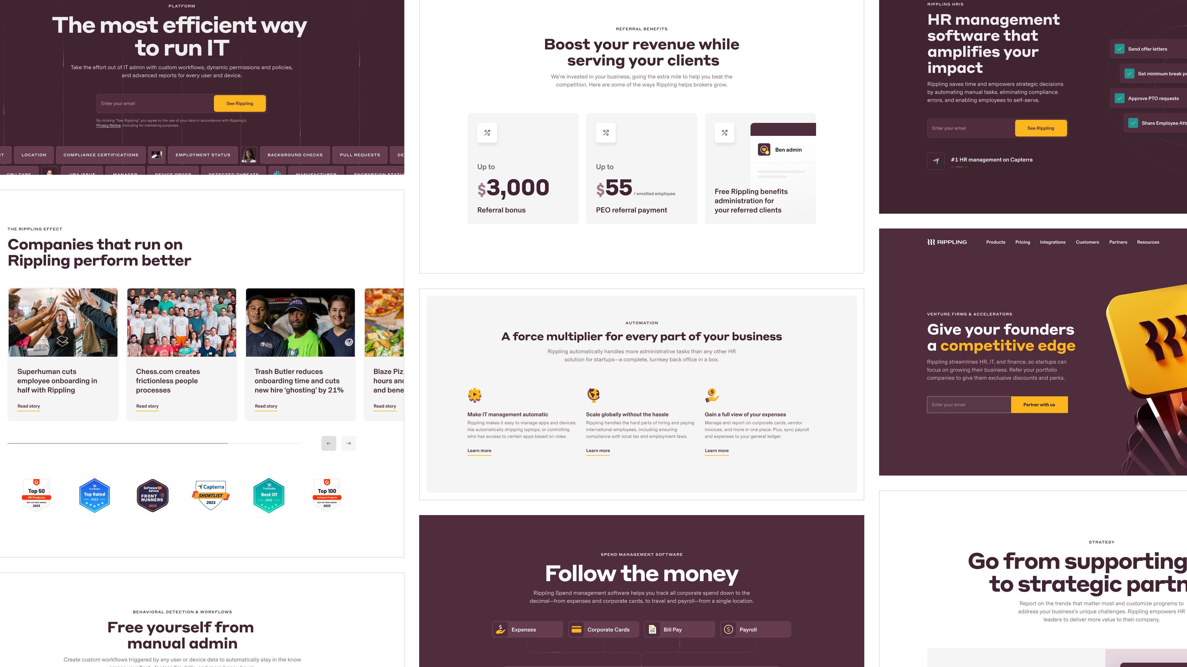
Extending our messaging platform to every page and module.
With a renewed focus on business outcomes, the team sprinted to revise 30+ pages across the site in under eight weeks to align with our brand platform: the Rippling effect.
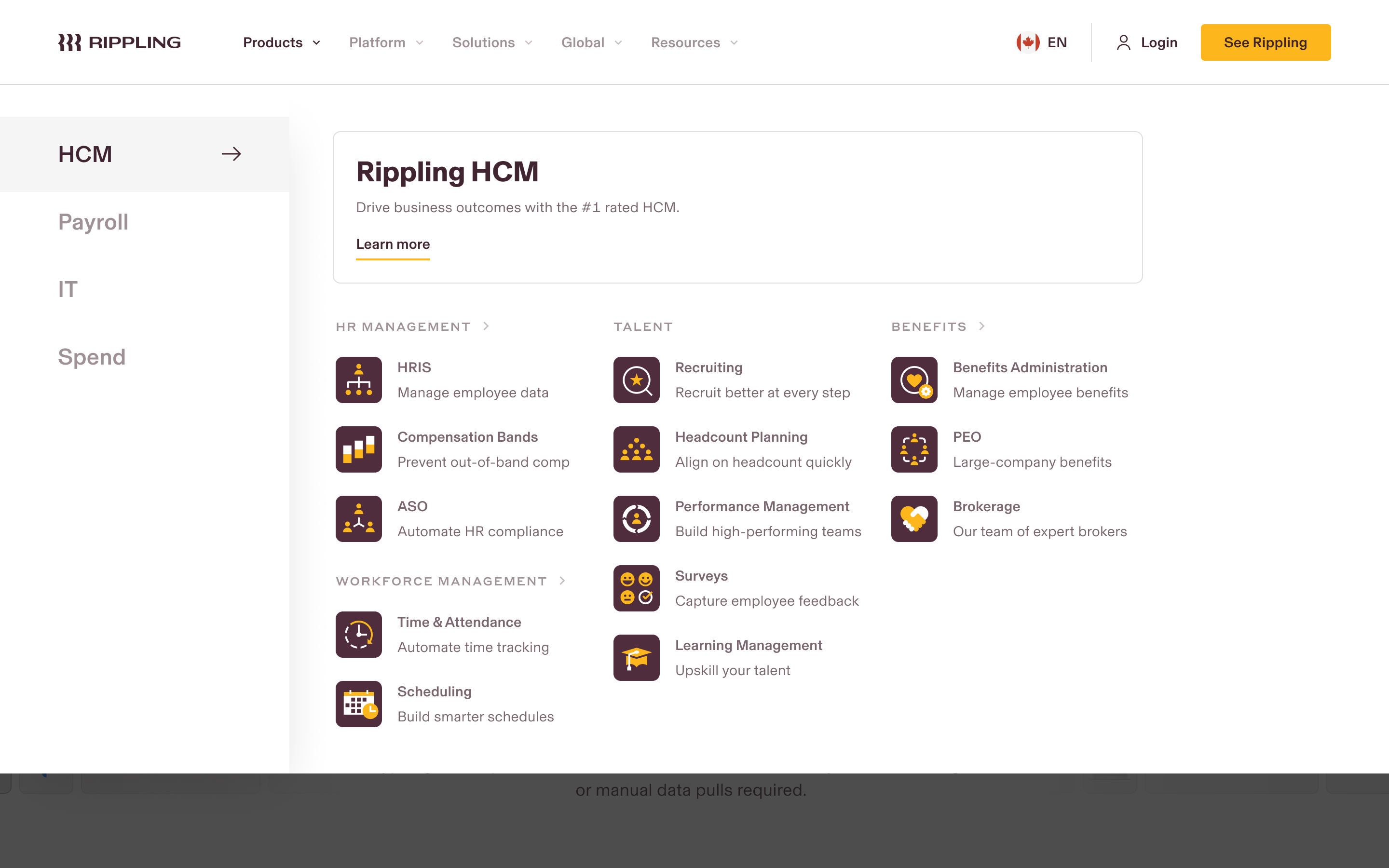
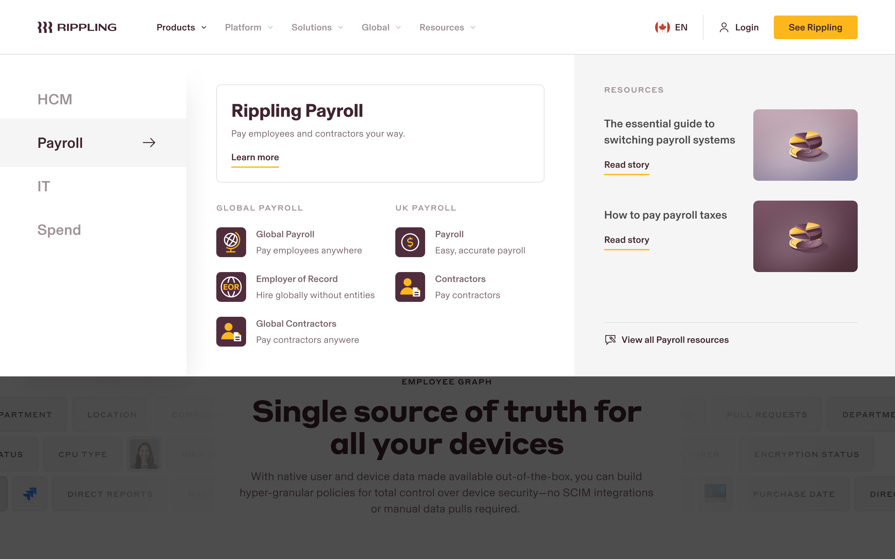
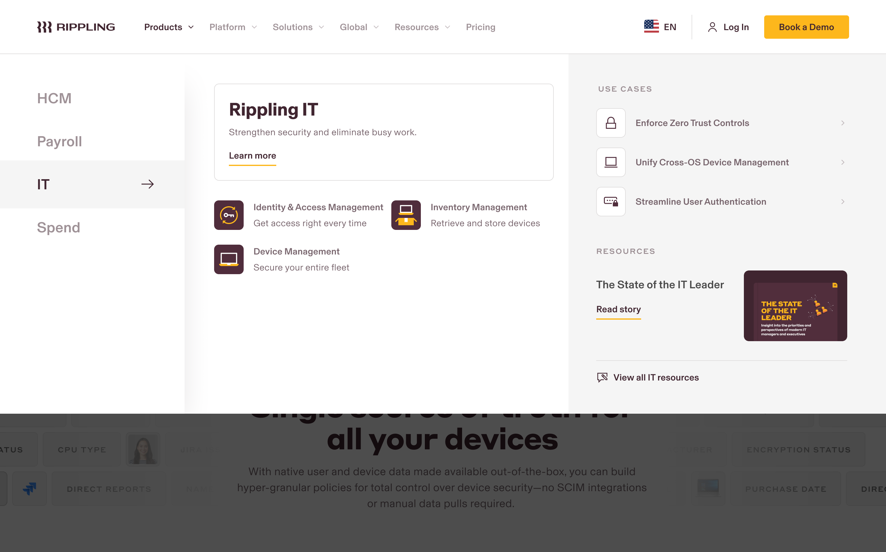
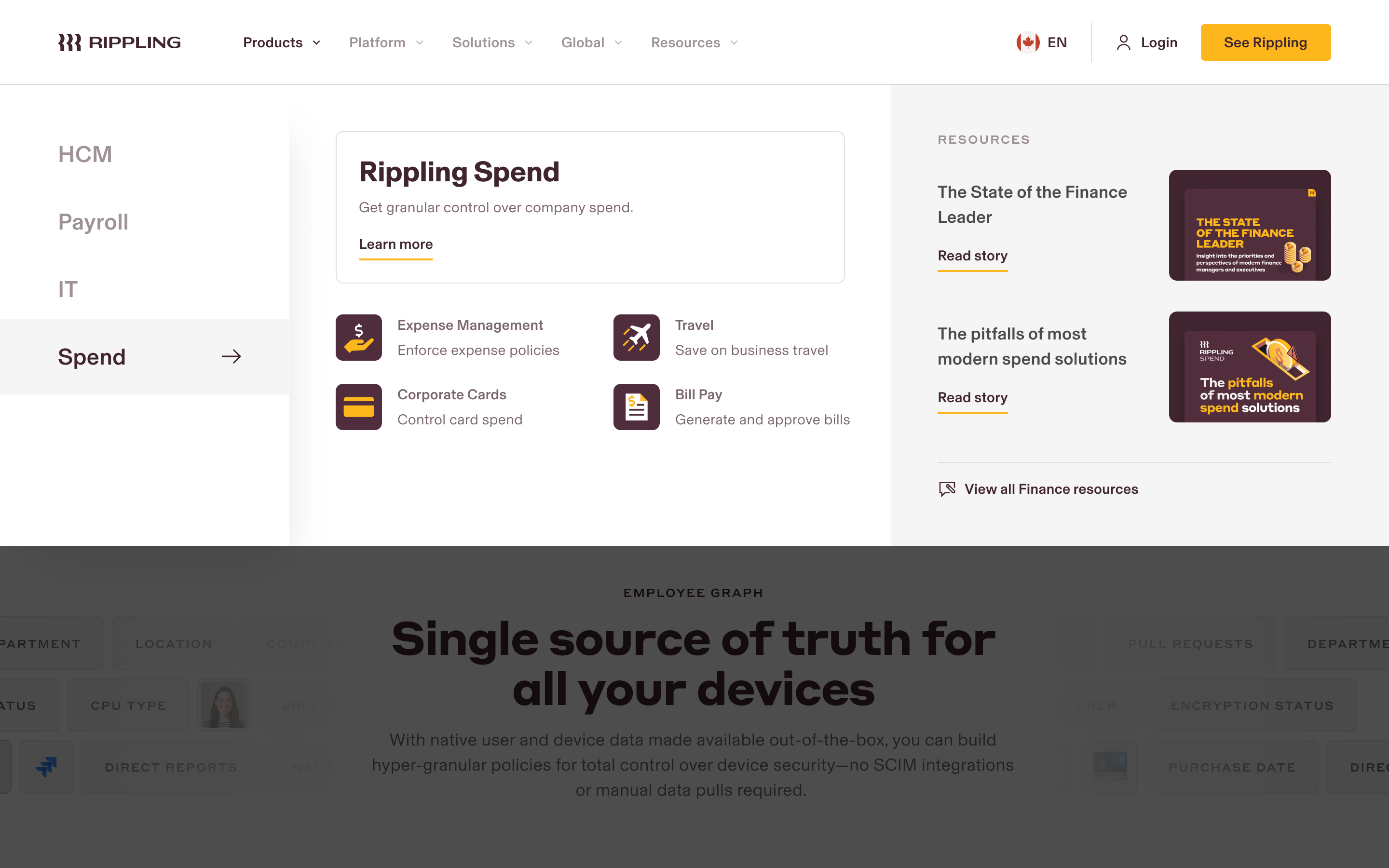
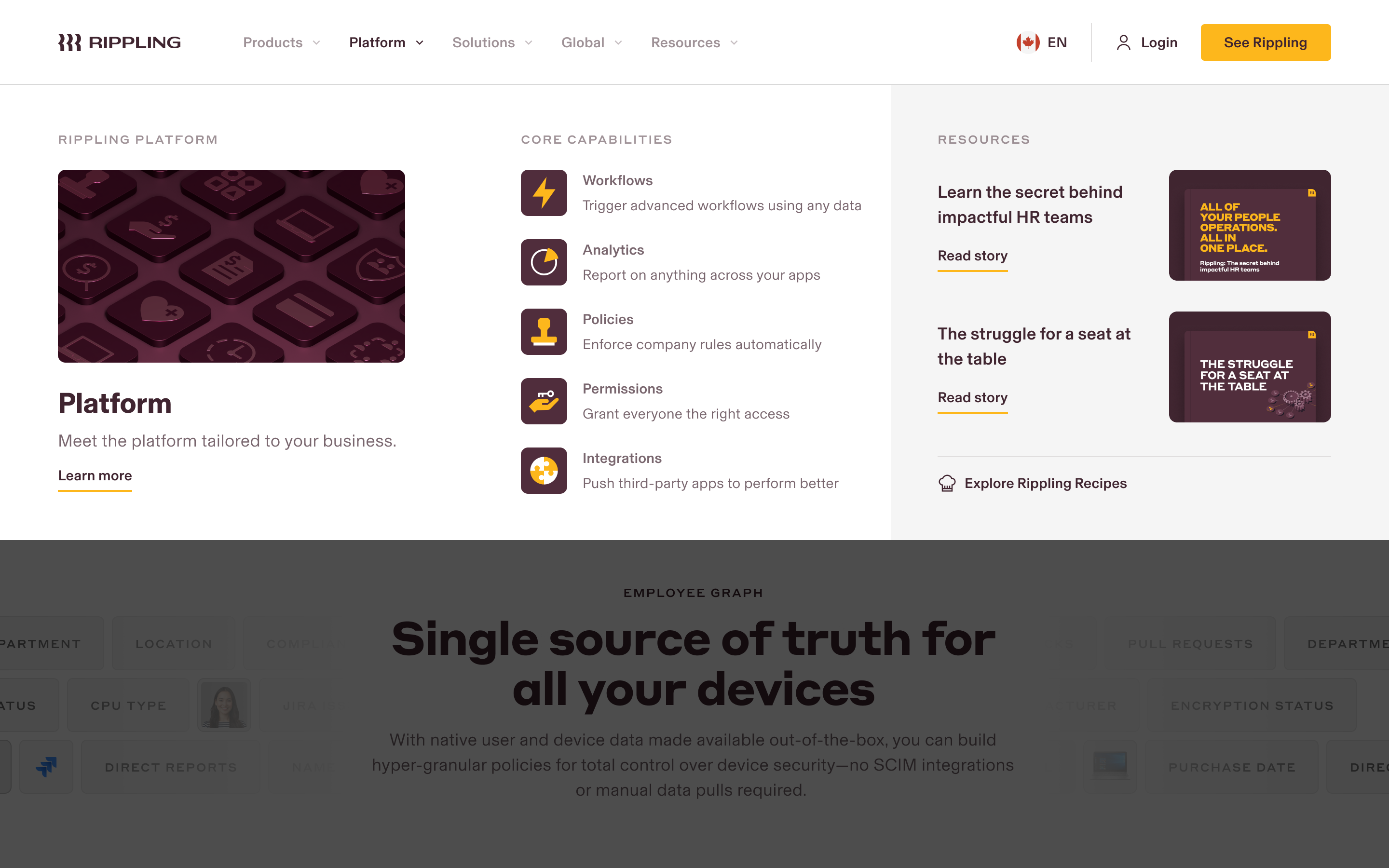
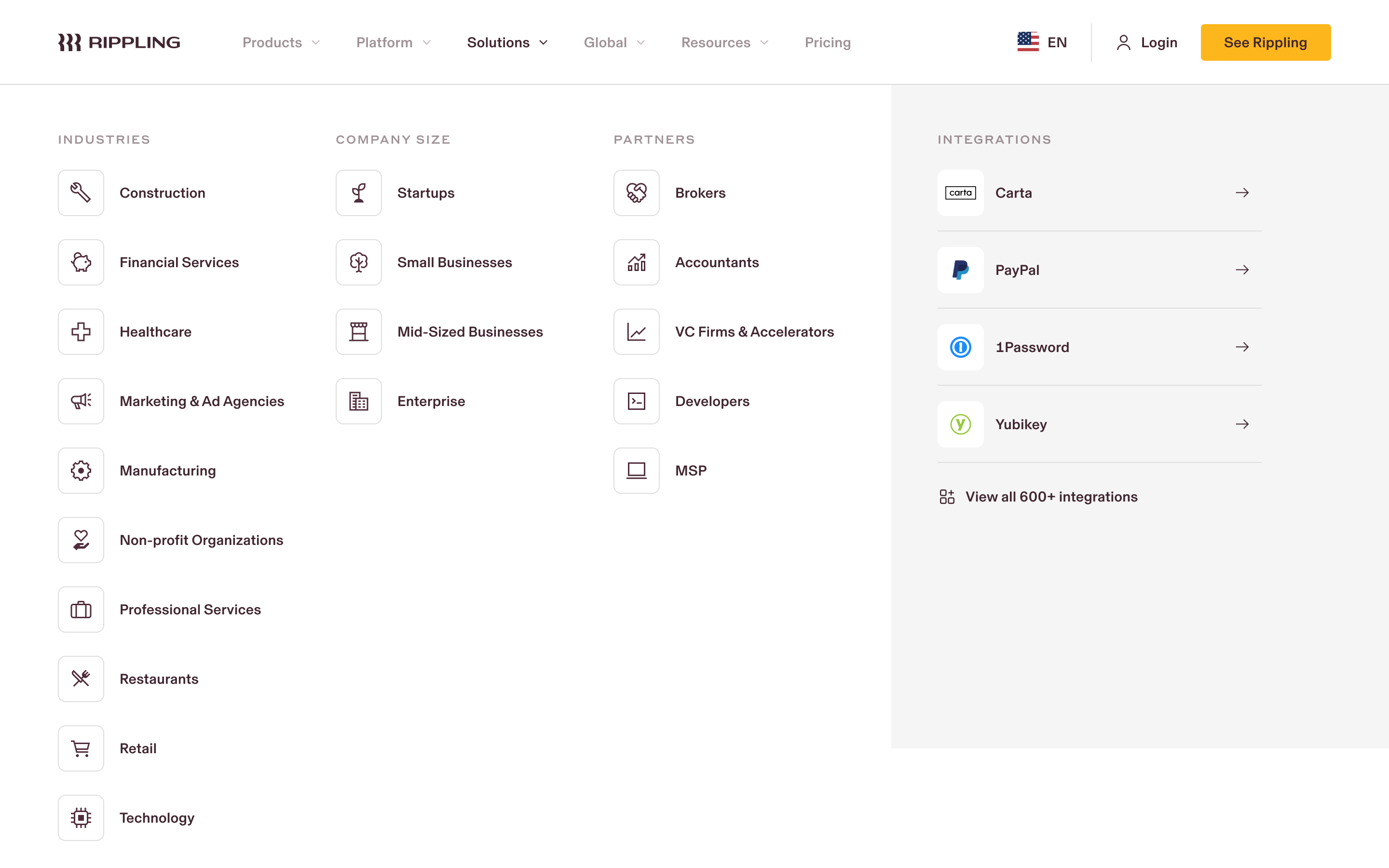
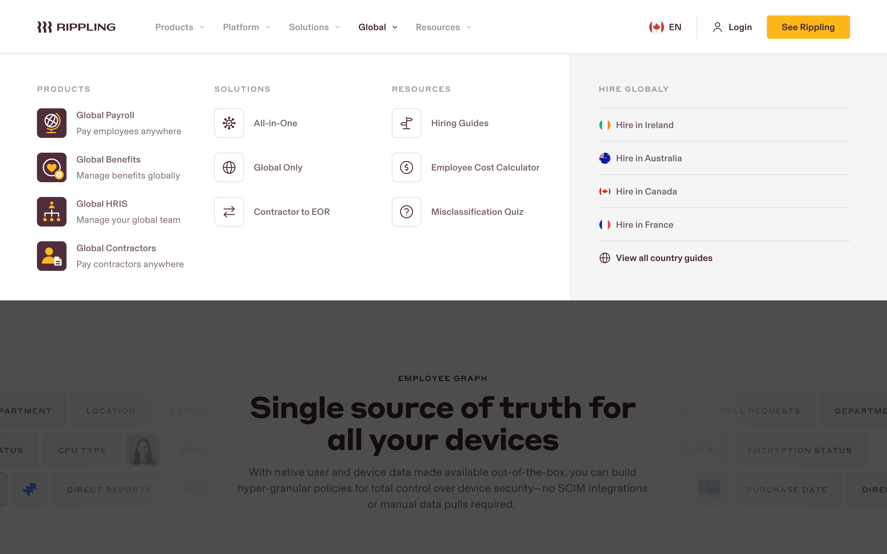
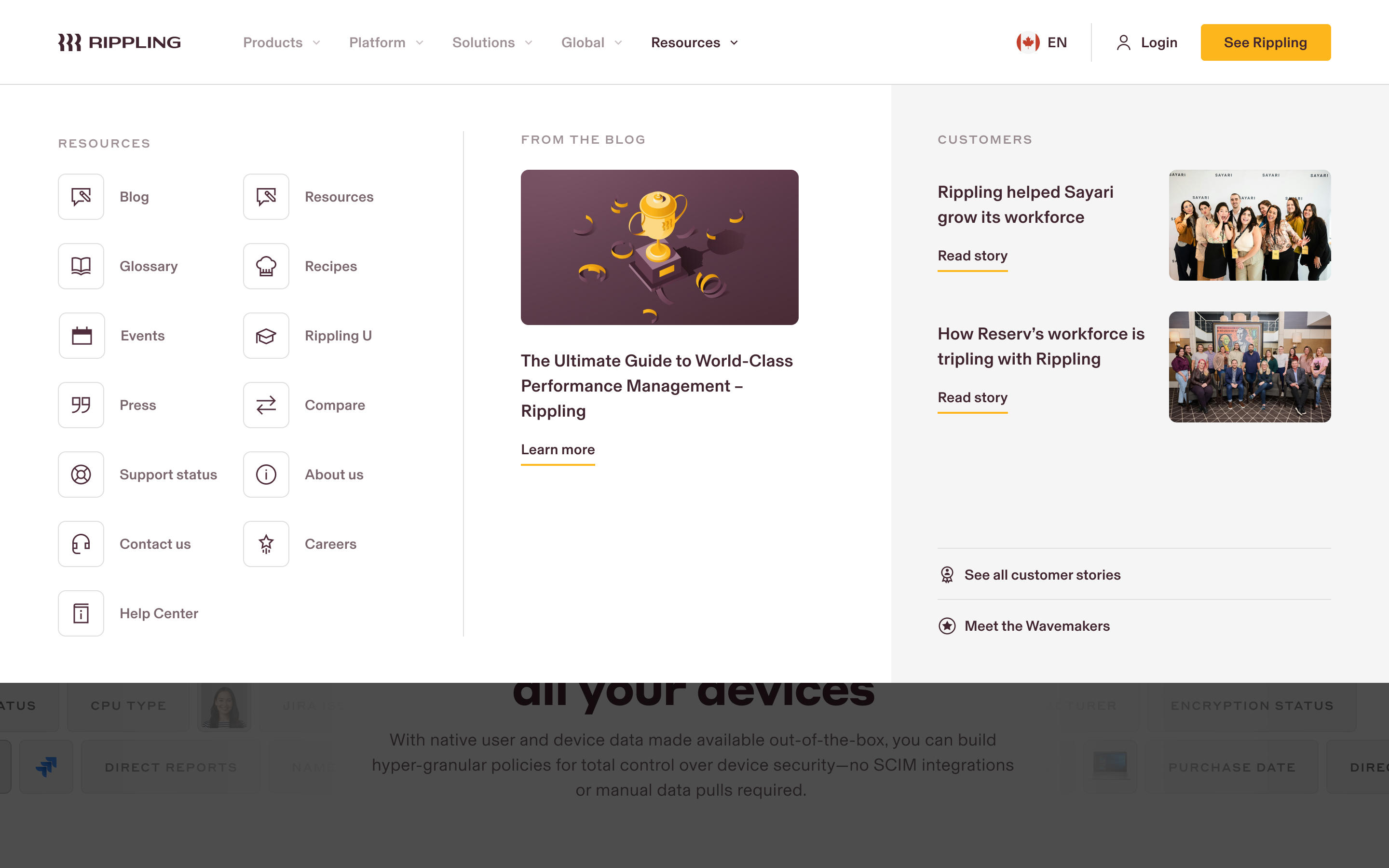
Updating the navigation to support a more robust marchitecture.
Over the course of my time at Rippling we've launched a new business suite (Spend), released thirteen new products, launched in six countries with seven global-specific products, as well as multiple audience segment-focused pages and resource libraries. This scale of growth has demanded multiple redesigns of our navigation to support an easily understood structure for an increasingly complex ecosystem.
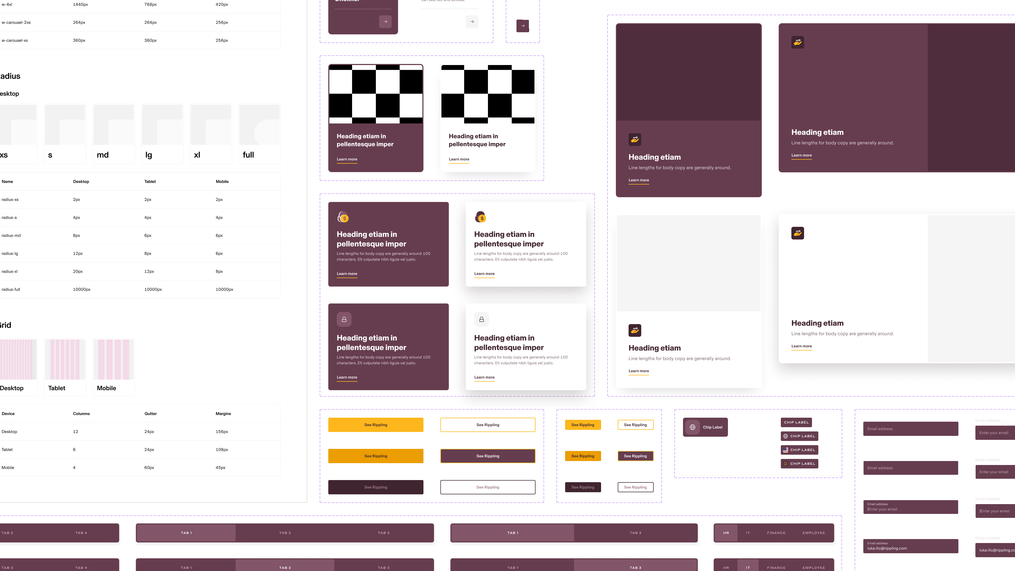
Modernizing the design system.
Through experimentation and iteration, the team built a robust atomic design system utilizing all of Figma's autolayout, token, and variant capabilities to speed up production and ease handoff to developers. Thanks to the new design system we've cut weeks from design and development time when it comes to repeatable pages.
Responsive variants.
Color tokens.
Faster production design and autolayout.
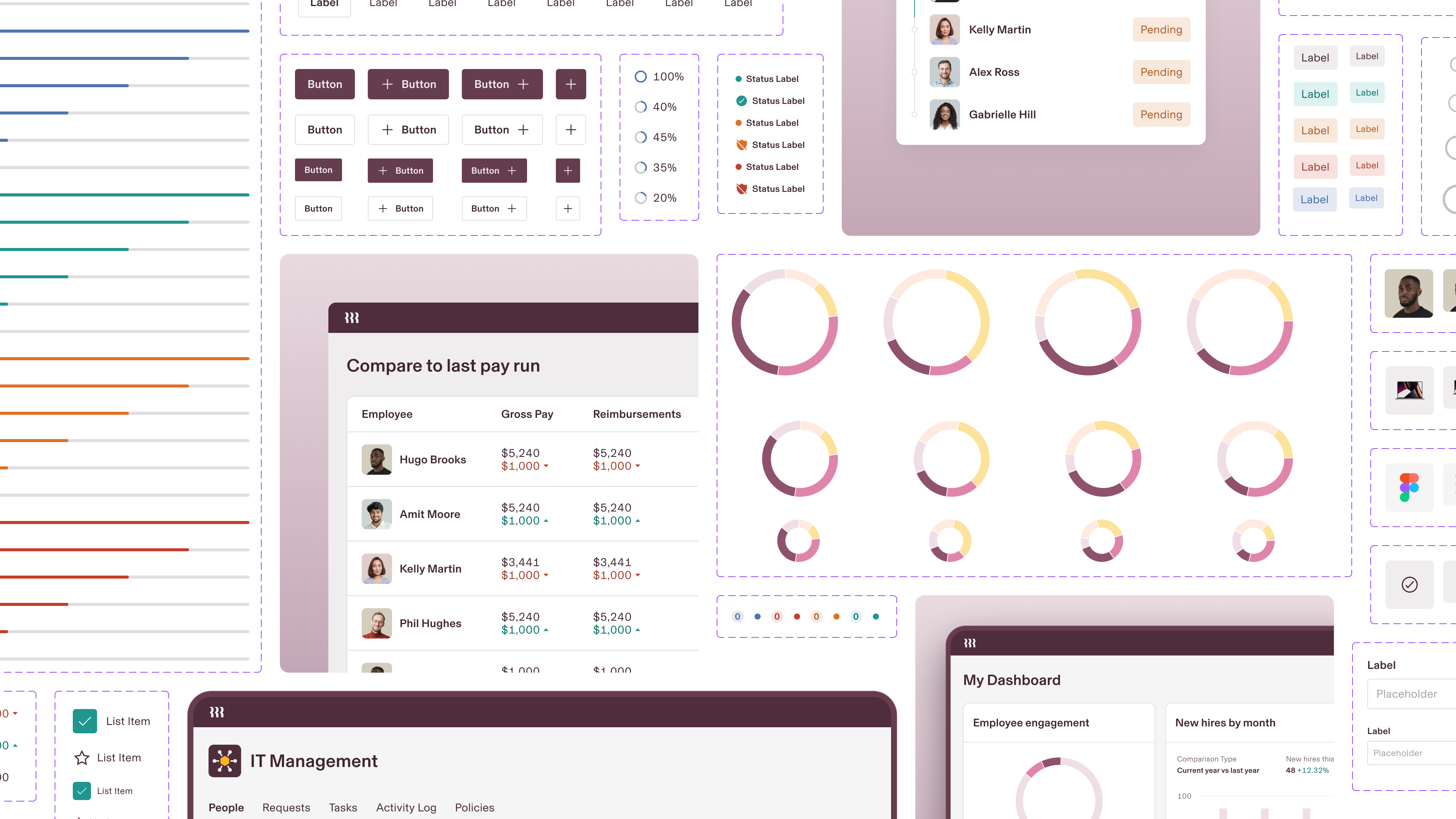
A design system for marketing UI assets.
While we always try to represent the product as close to reality as possible, the complexity can often be overwhelming. We created a simplified design system for marketing UI assets that's allowed us to scale production speed and onboard new members of the team with a reduced learning curve.
Bringing our product to life.
Wherever we can, we showcase the power of Rippling through real-world use cases and animations. Animations are quick and easy to follow.
Moments of delight.
We turn abstract and complex concepts like compliance into animations that capture the ease and simplicity of managing these things with Rippling.
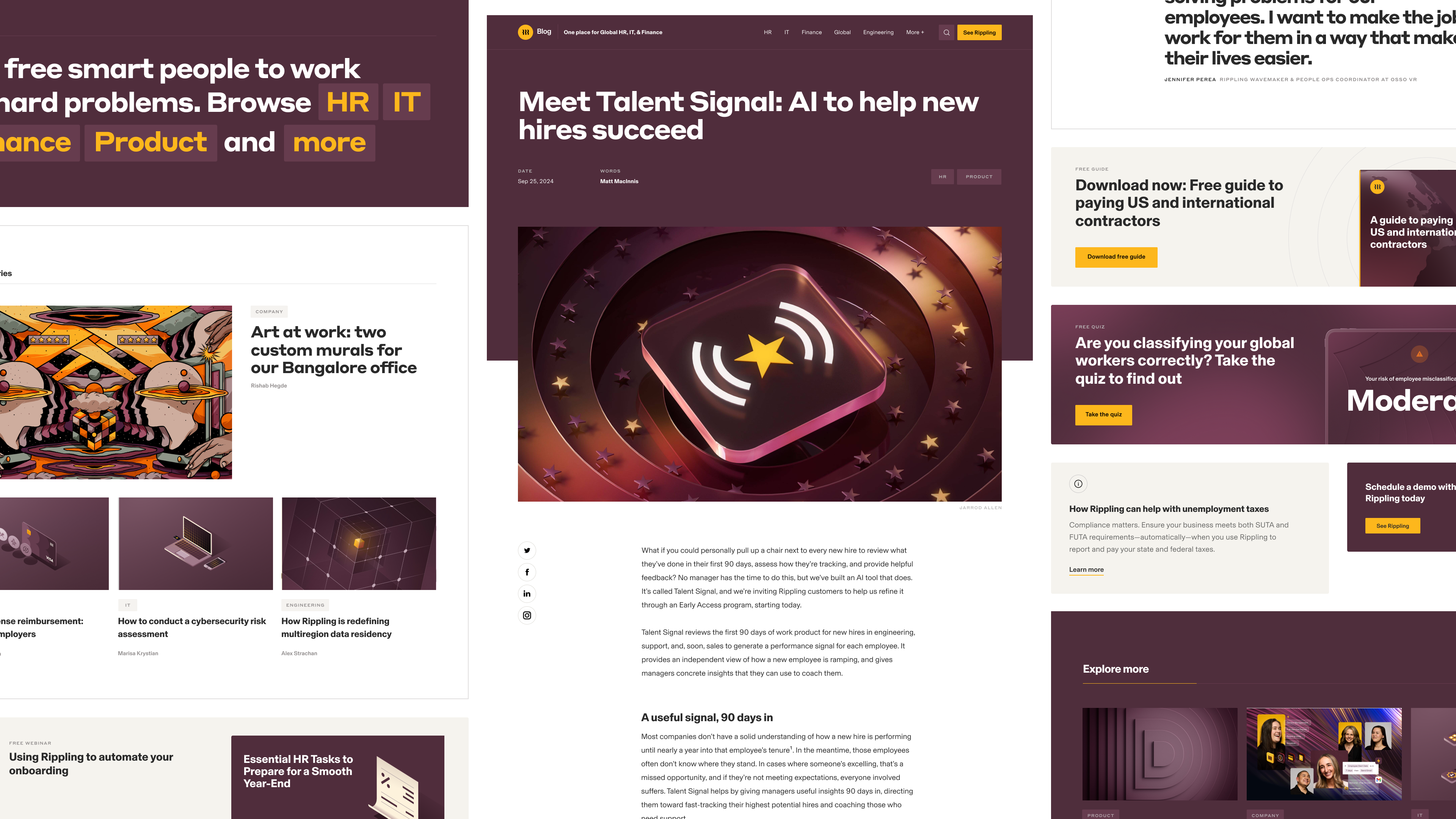
Re-architecting the blog.
Rippling's original blog was simple—a hero image and text. With a newly hired content team to support the next phase of growth, the Rippling blog was now the centerpiece for driving traffic and leads. We redesigned the blog to support more categories of content, including SEO-focused articles, and added multiple options and placements for conversion modules throughout the experience.
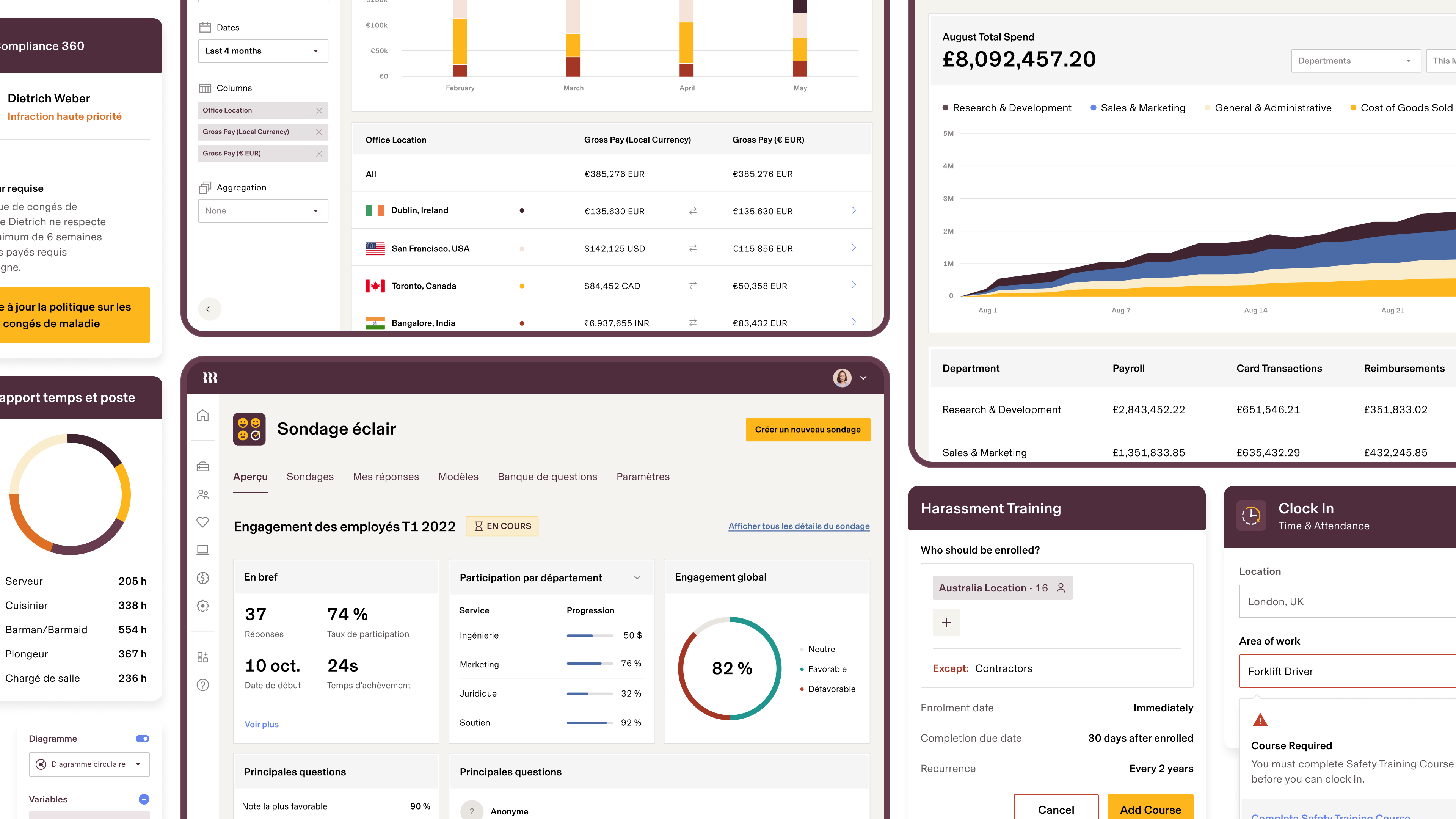
Localizing assets.
Localizing a site with hundreds of pages is no small effort. Working with our translation partner, we established a process with a Figma source of truth and a translation plug in whereby we could export and re-intake strings straight from Figma. The team rebuilt every single product asset across the site in autolayout to seamlessly accept translations and reduce QA time. We also make localization adjustments like customizing location names to be region-specific. The site now supports seven regions and counting.
Brand Studio