UCSF.
One of the top five hospitals in the nation, UCSF Health focuses on specialty and critical care patients—individuals dealing with incredibly rare or chronic illnesses. With this in mind, the Huge team designed an experience focused on clarity, medical innovation, and most importantly, humanity.
As ACD, I lead a team of visual and UX designers in the ideation and design of an end-to-end web experience and atomic design system. I also worked closely with our program director to ensure our deliverables matched our timeline. Throughout the project, we partnered with UCSF's internal design, brand, marketing, and engineering leads to advocate for our approach with C-level stakeholders.
Vision
Create a seamless and unified digital front door for UCSF Health patients.
Goals
Improve the patient experience.
Provide resources, education, clarity, and reassurance.
Attract patients and partners.
A digital experience that matches UCSF Health's reputation.

Prioritizing users.
During discovery, we worked with UCSF to identify the different types of users they needed to be addressing. We aligned to a narrower field so when inevitable trade-offs would have to be made, we knew where to place emphasis.
User insights.
UCSF Health specializes in chronic and specialty care patients. In early user research, it was clear that patients were overwhelmed with the amount of information available (try Googling "cancer") and were unclear about the treatment process, options, and other support resources available.
"It's a lot of information when you're going through cancer. It's pretty overwhelming."
— UCSF Patient
"I really need some emotional support and insights on how to take care of myself after the surgery."
— UCSF Patient
Timeline.
With a massive amount of work in front of us and a finite amount of time, I worked with our program director to create a timeline that enabled the design team to establish a module library early and pick up speed later.


Understanding the patient journey.
The UX team lead the creation of a robust patient journey. Together, we used this as a kicking off point for brainstorming opportunities for improvement within UCSF Health's digital ecosystem.
Experience principles.
Before kicking off design, the design team established experience principles based off UCSF Health's goals, competitive differentiators, and user insights.
Relentless pursuit of care.
Our reputation for thought leadership, cutting edge research, and quality care should out in everything we do.
Empower with information, not overwhelm.
The right kind of knowledge and context leads to greater understanding and a sense of control.
Complement human care with digital connection.
Help patients find information, tell an inspiring story, and reveal paths toward care and treatment.
Unite a complex health ecosystem.
Bridge gaps with powerful search, clear navigation, and seamless wayfinding. Ensure no dead ends with paths to related content.
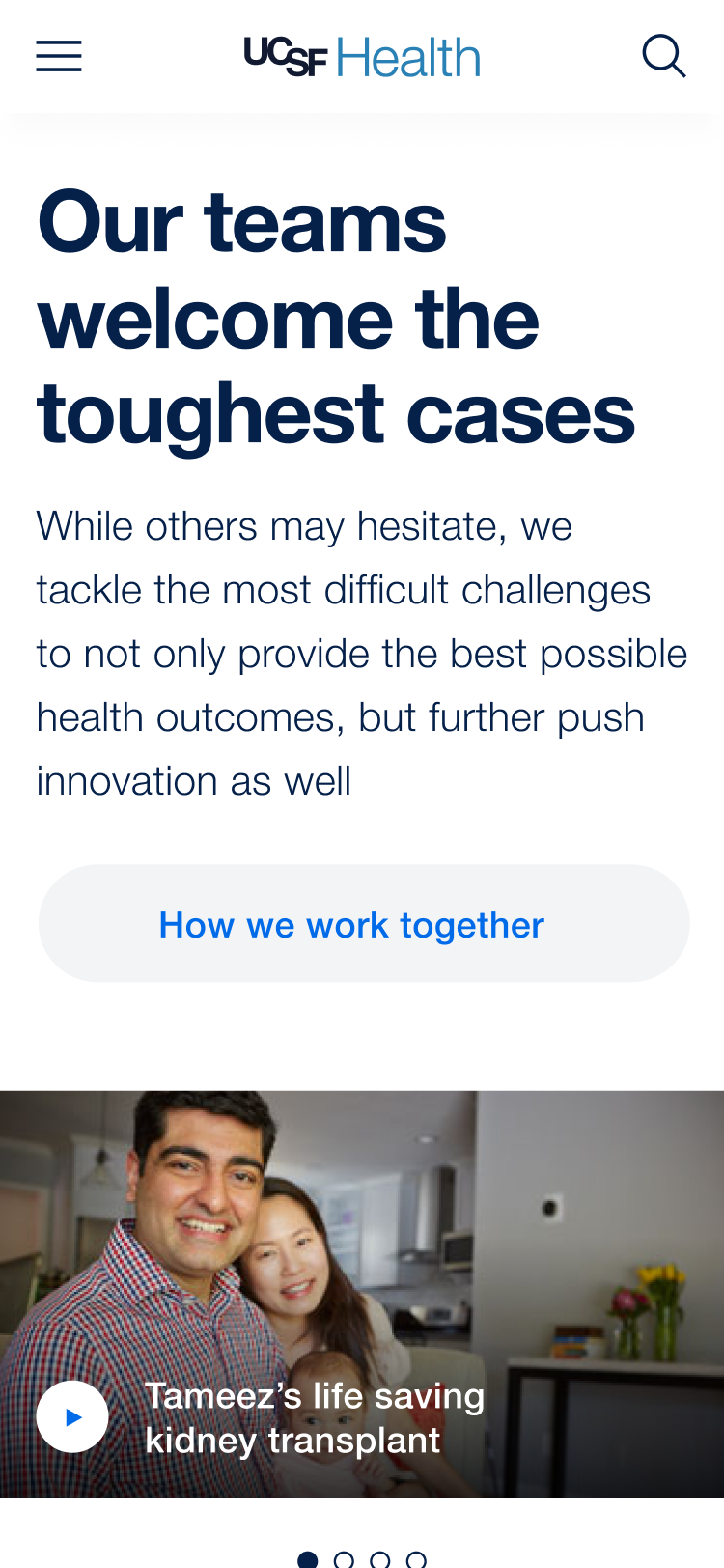
Use stories to connect, inspire, and reassure.
Personal narratives humanize complex medical terminology and show us we're not alone.
An organic brand language.
We developed an organic motion and visual language across the ecosystem to make UCSF feel alive and responsive to patients while breaking down the expectation of a cold, sterile, or unwelcoming institutional hospital environment.
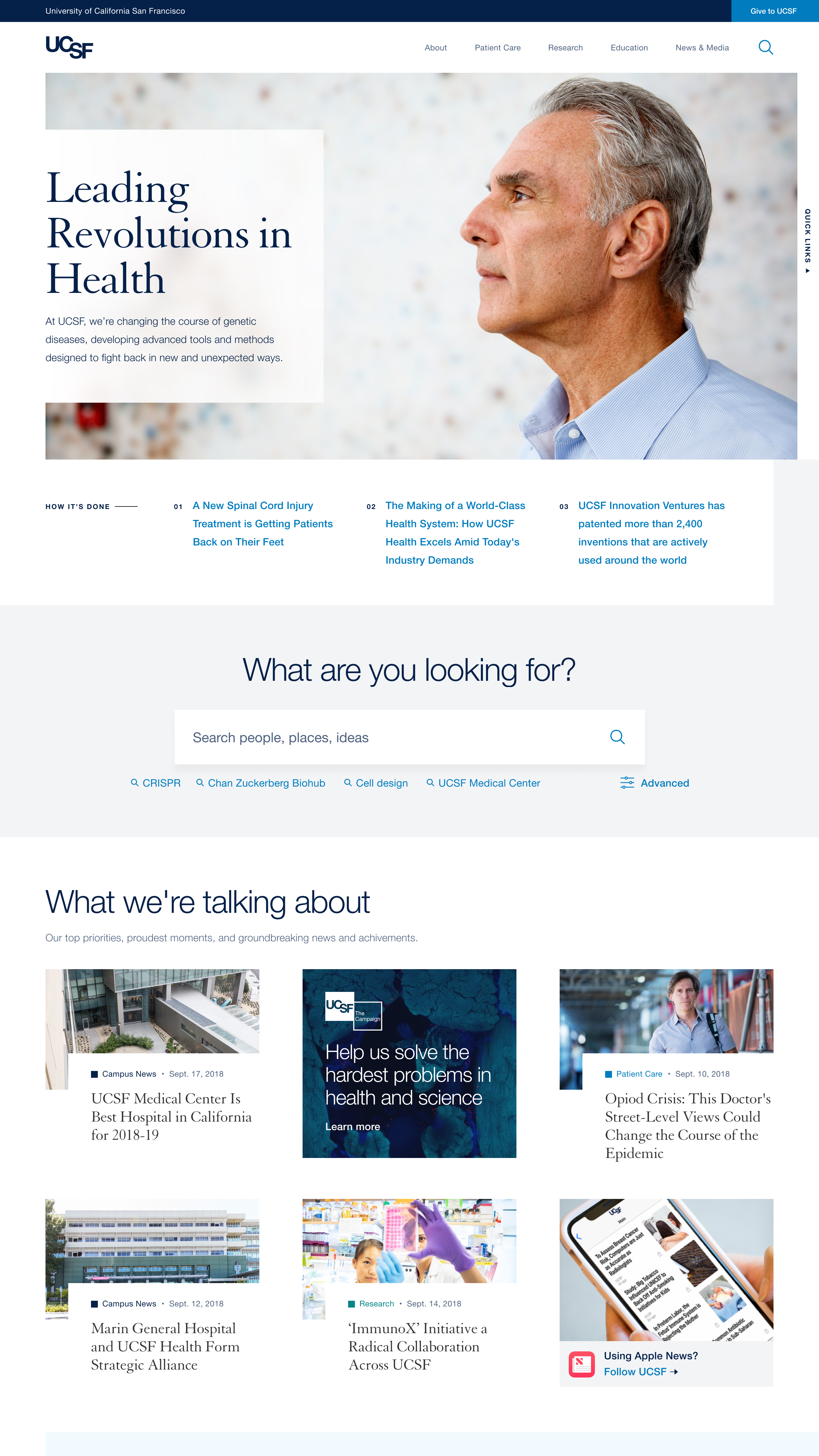
An introduction to UCSF: Moments of Hope.
"Moments of Hope" exist at the intersection of inspirational patient stories and UCSF's unique philosophy and approach. Text animates at the pace of conversation, inviting patients in to discover and connect as if starting a dialogue with their doctor.
A home page that reflects patient priorities.
Find conditions.
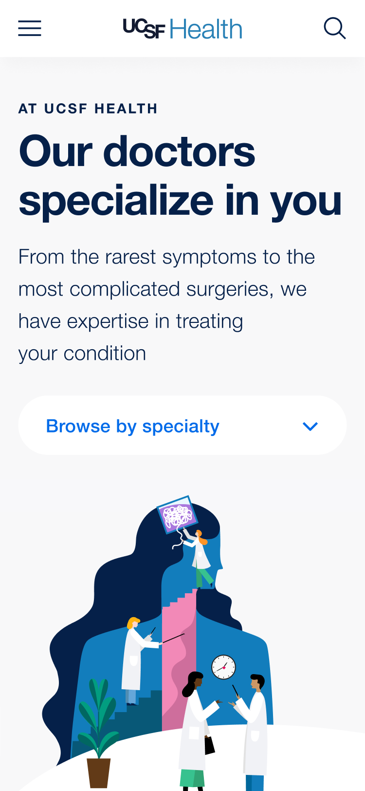
Connect with stories.
Build trust.

Navigate the ecosystem.
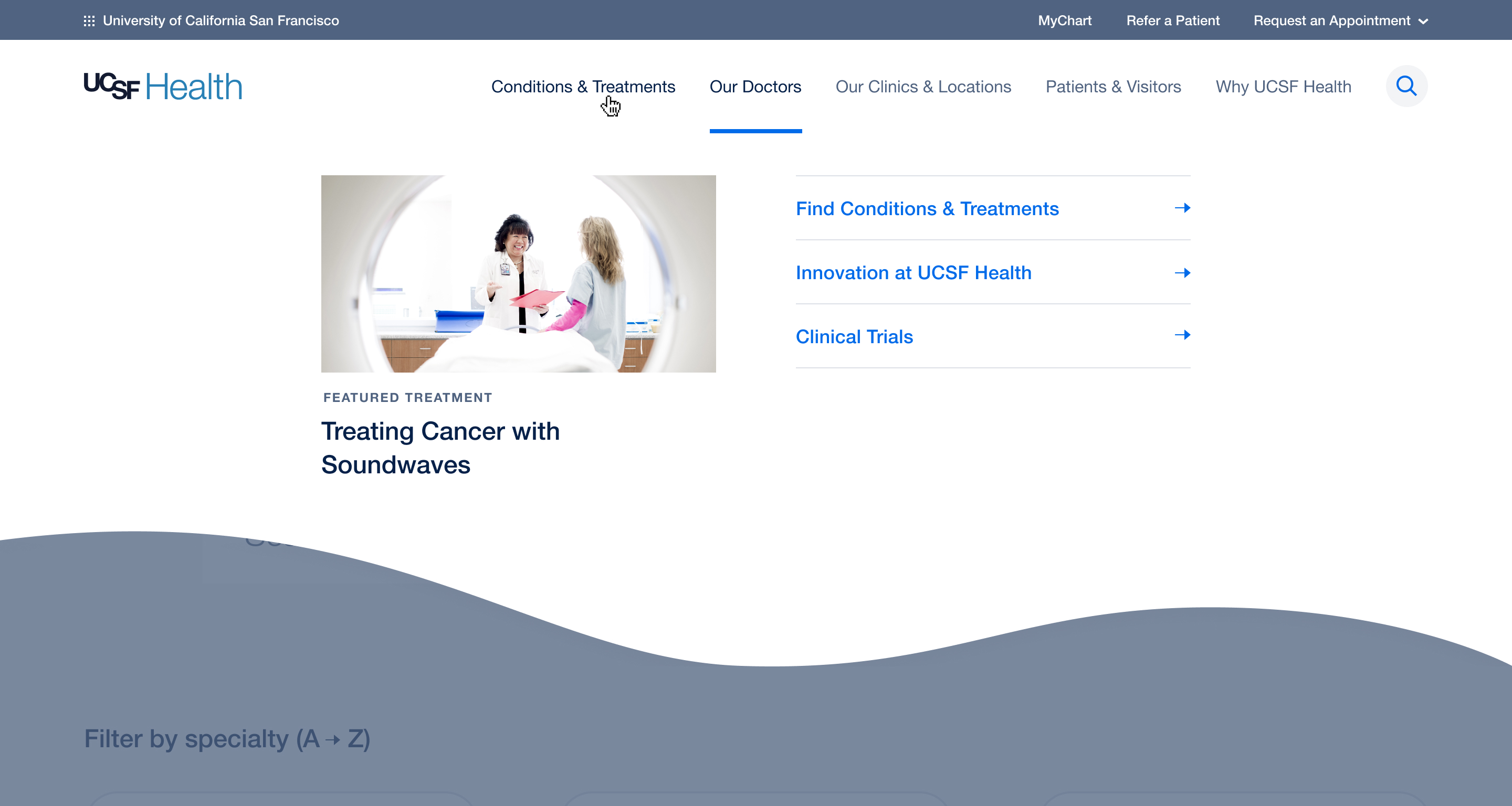

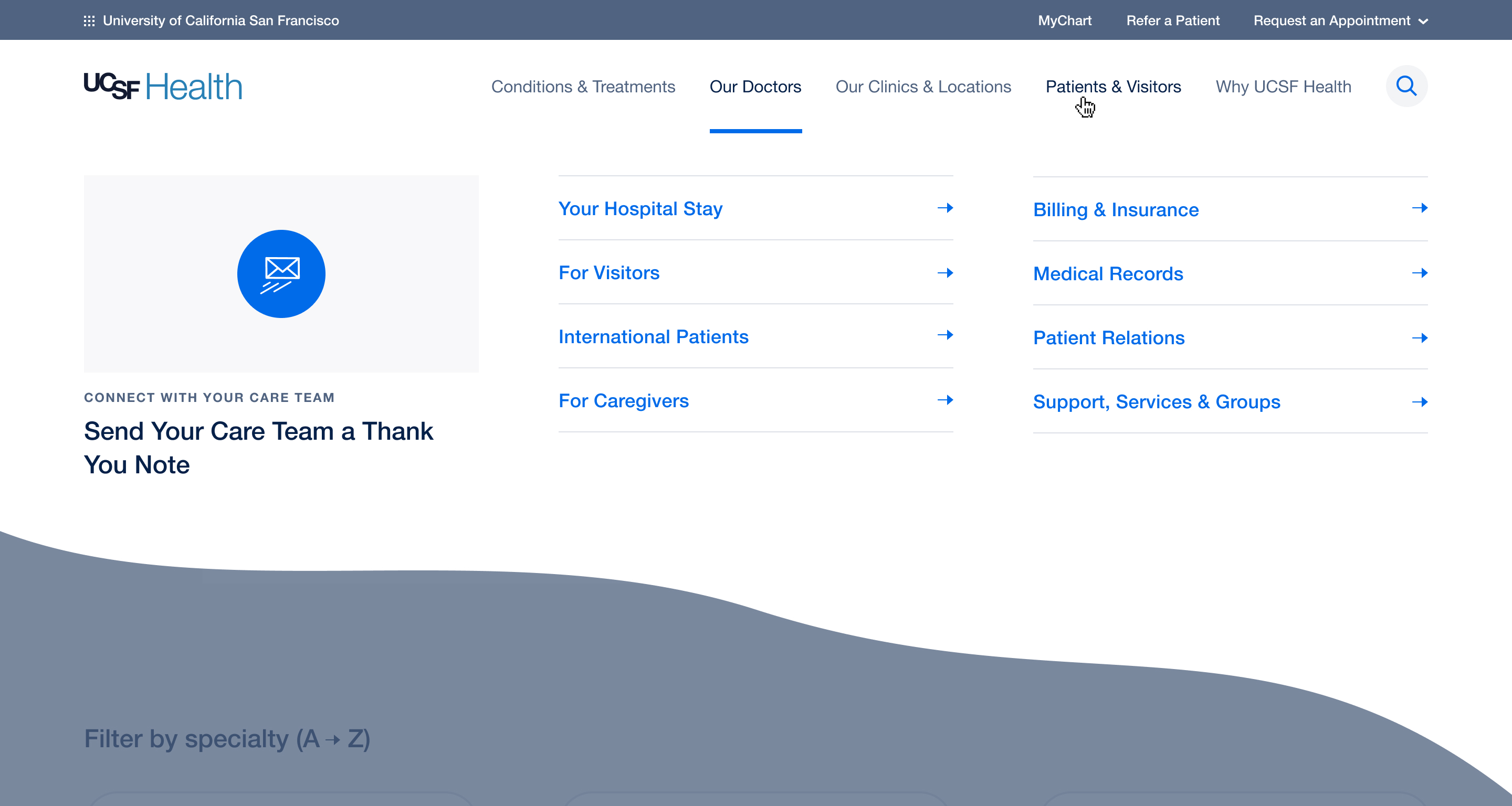

Re-architecting and contextualizing a complex ecosystem.
We re-oriented UCSF Health's navigation to put patient priorities first and ordered them in a way that reflects the patient's journey from diagnosis to treatment. Within each category, we also provided a flexible space for featured content ranging from marketing to quick links.
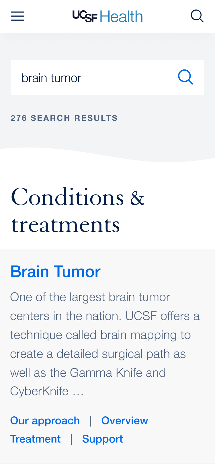
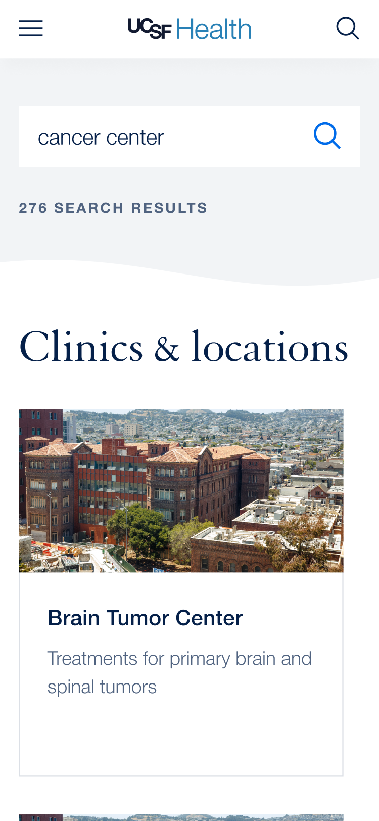

Search visual categories, ordered by relevance.
When designing search across a massive organization, we wanted to ensure that results were categorized to help users navigate the ecosystem. We then took it one step further, ensuring the most relevant category always populates the top spot.
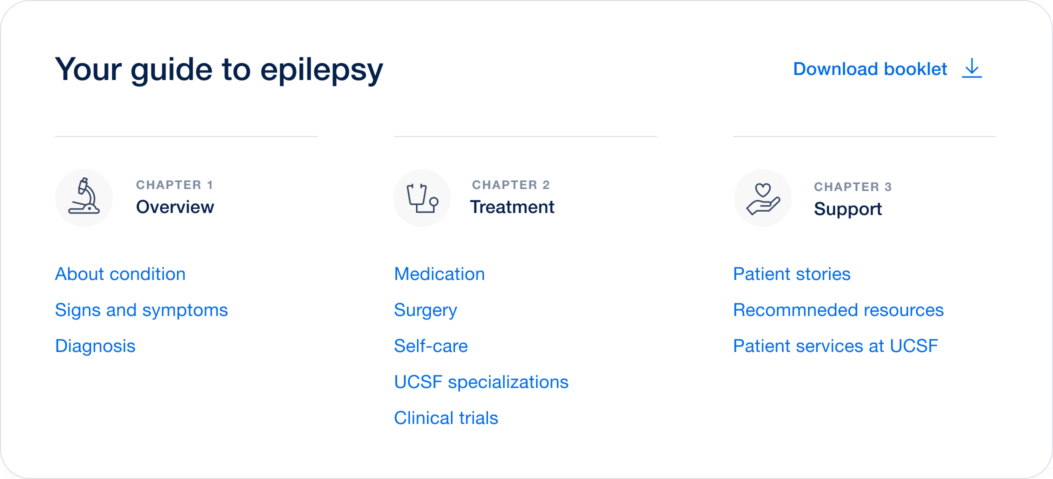
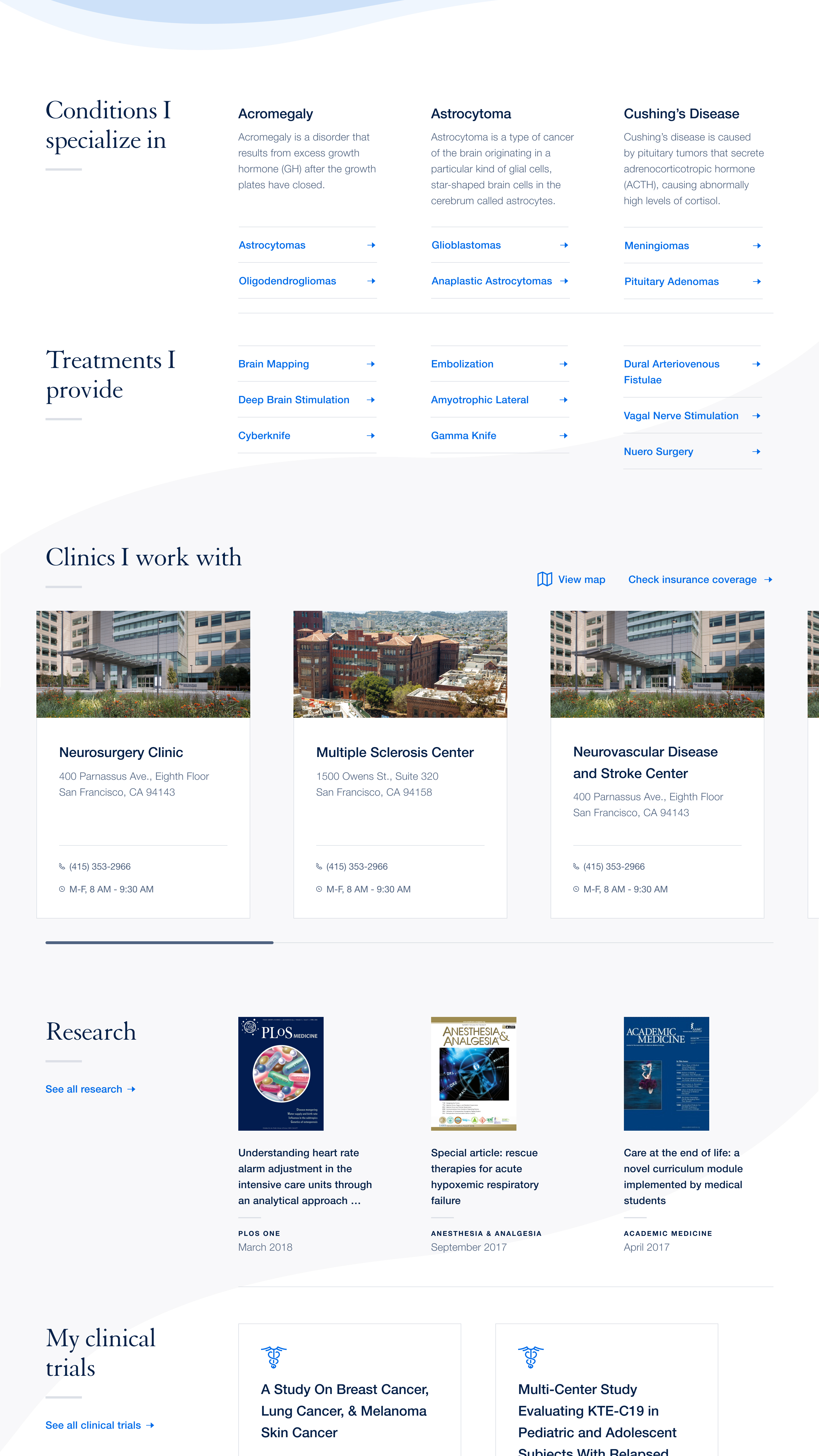
Navigating an overwhelming amount of information.
In our content audit, we discovered that many conditions contained pages upon pages of information, all of it poorly organized with key content hidden within archaic pagination. We designed a table of contents overview that locks to the side of the page as the user browses so users can quickly jump around to find answers.
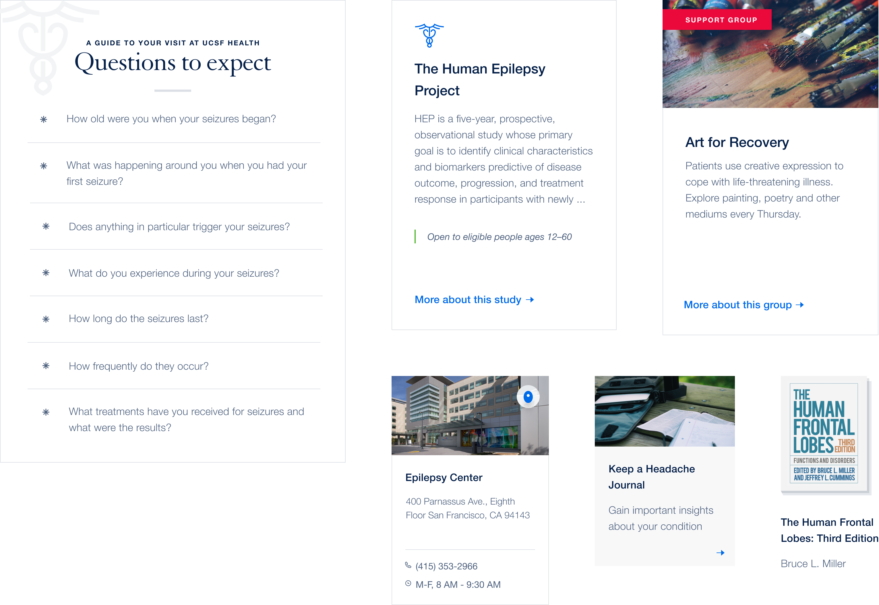
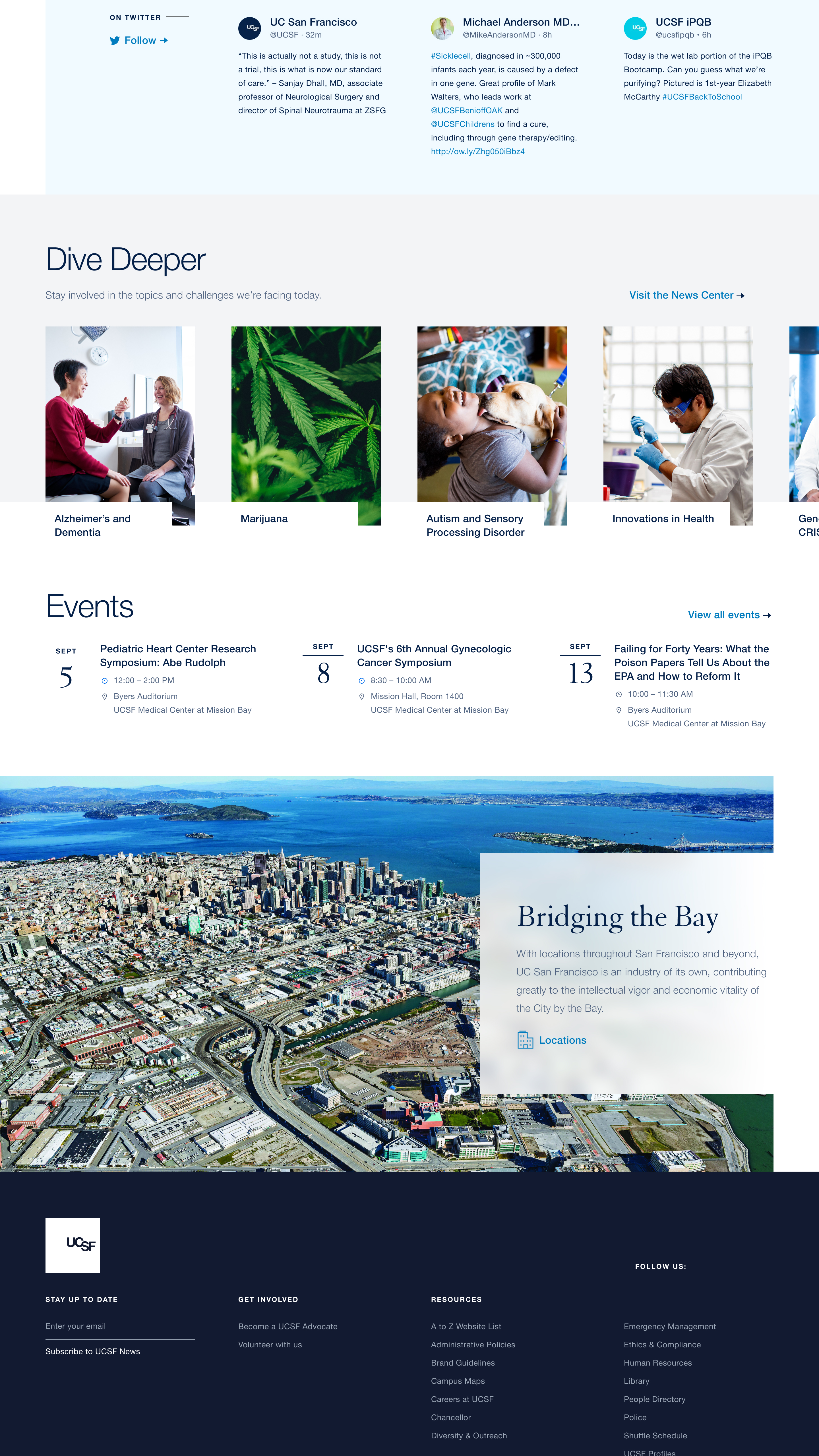
Surfacing important and unexpected resources.
Not only did we want to make navigating content easier, we wanted to bring to life the incredible amount of articles, services, clinical trials, locations, references, and recommendations UCSF provides. We also complemented that content with helpful, more conversational modules to prepare patients with questions to ask, what to bring to an appointment, and guidance to personal care.
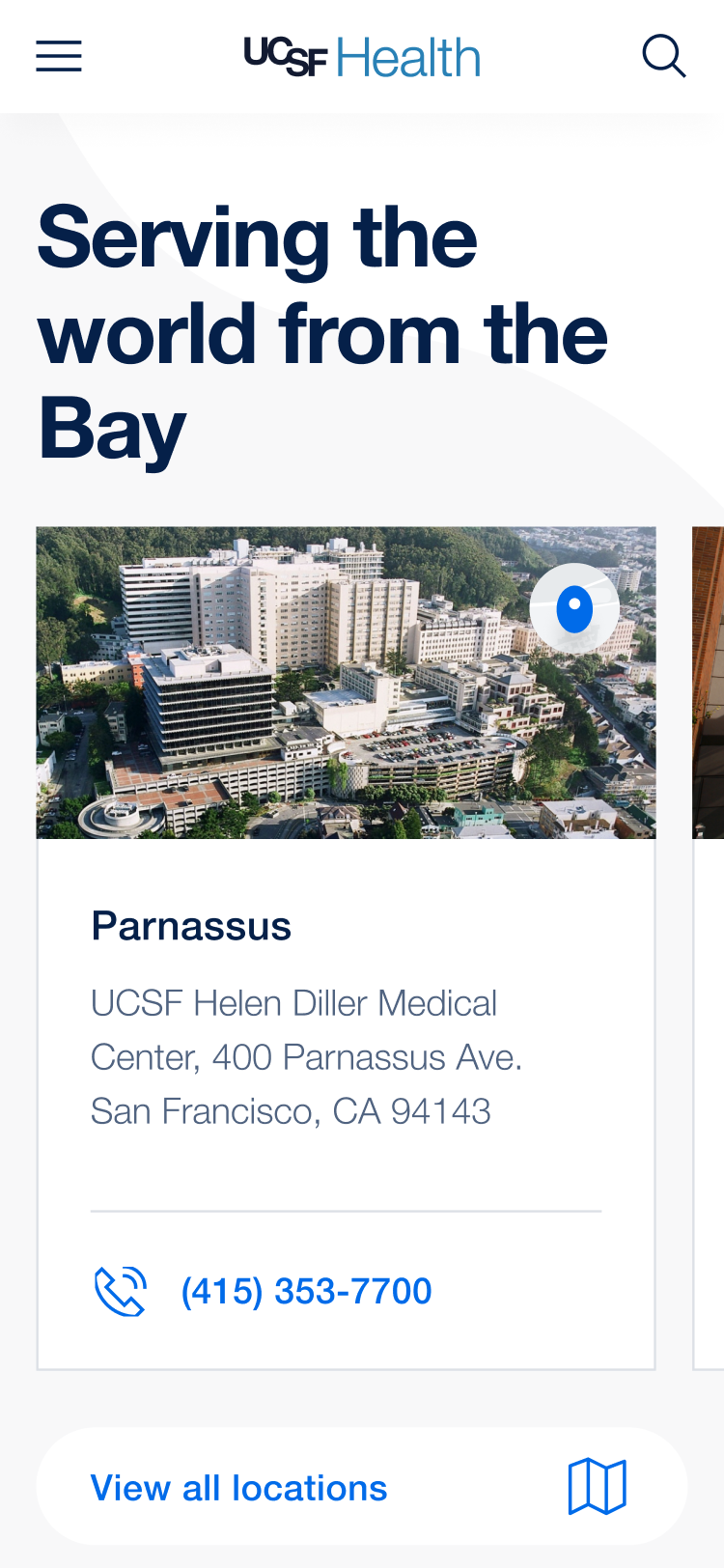
Solving the missed appointment problem.
With hundreds of partners and dozens of satellite locations, it can be really challenging to get to an appointment. It's so challenging that missed appointments are UCSF's primary source of lost revenue. With this in mind, we designed a collection of modules and location pages with robust instructions, shuttle information, and even APIs connected to local bus routes.
Custom maps.
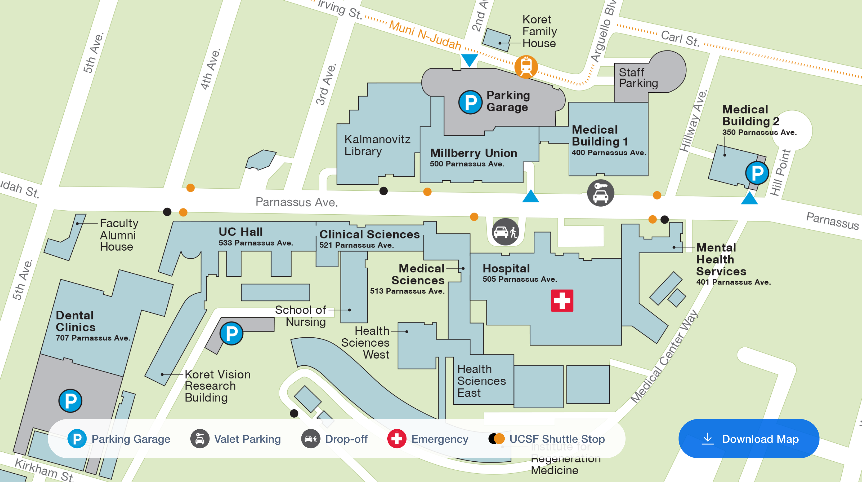
Embedded clinic maps with translations available.
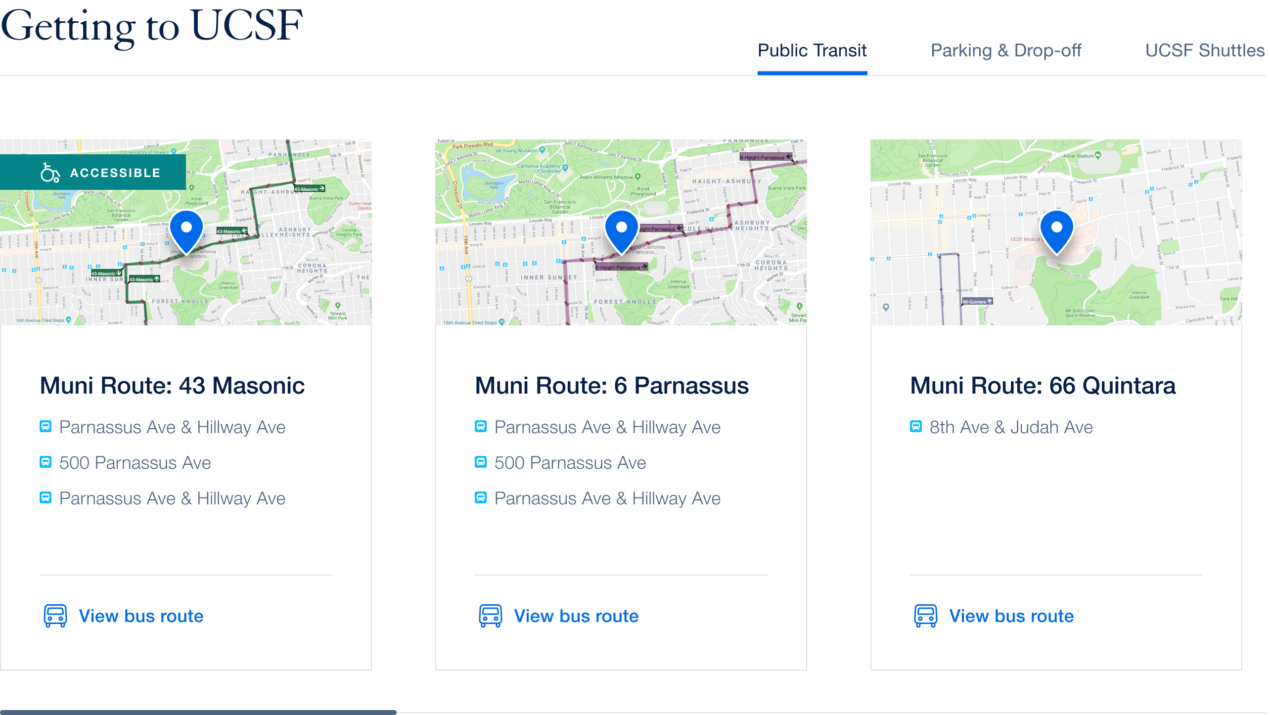
Live transit, parking, and UCSF shuttle info.
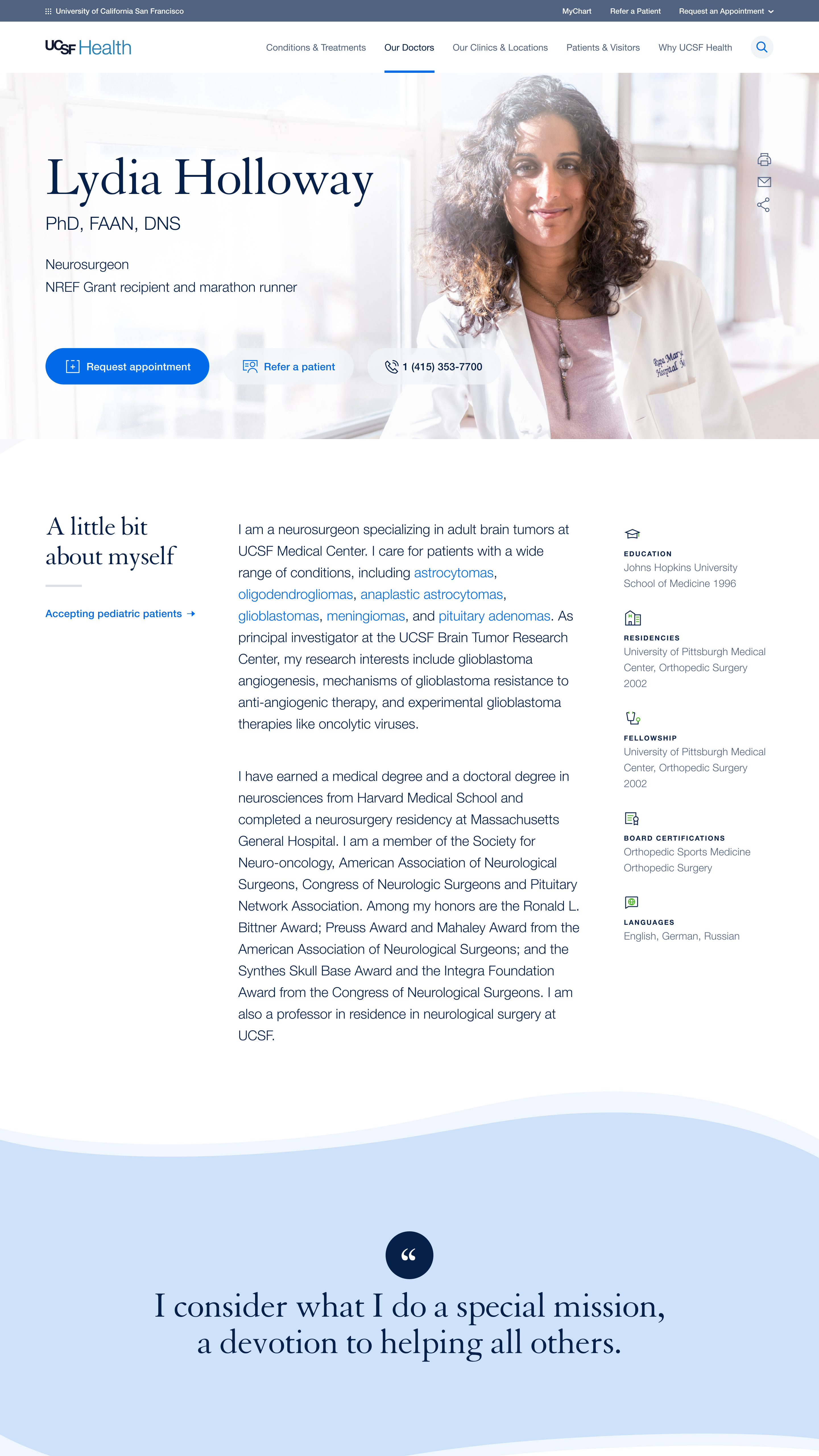
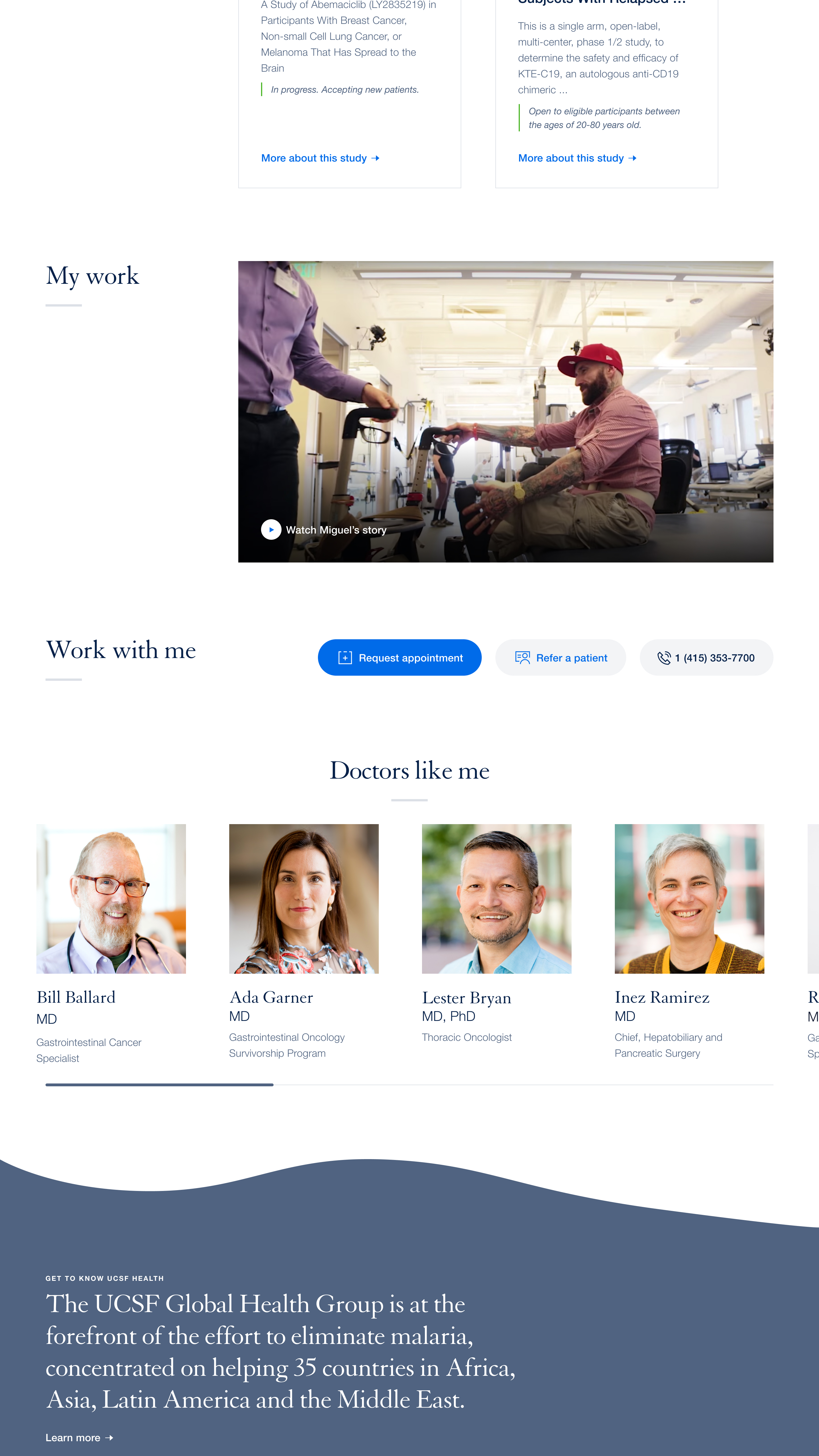
A robust set of modules for individualized storytelling.
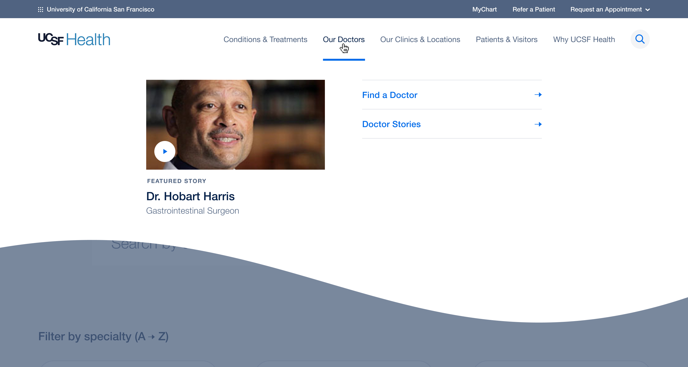
UCSF's doctors number in the thousands, each with their own background, philosophy, expertise, and achievements. We built a system of modules to help each doctor tell their own individual stories. At the bottom of every page, patients are able to browse similar doctors, providing better access to options.
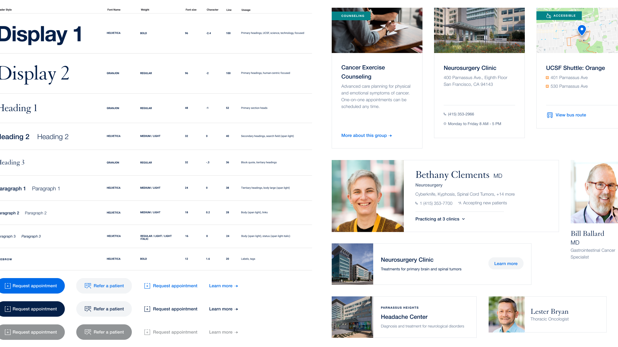
A design system that scales.
As we designed individual pages, we were also building an atomic design library in parallel. As part of the hand off to the UCSF team, we developed documentation in Frontify so they could adapt and scale the system for future needs.
Extending to UCSF.edu.
After we completed the UCSF Health redesign, the other, academic side of the business engaged with us to redesign their digital experience as well. We were able to execute on a new set of goals and priorities in a tighter timeline and with a smaller team thanks to the design system we had established for UCSF Health.
Experience principles.
Exemplify and manifest “Redefining possible.”
Always provide a clear next step.
Instill belonging by turning users into active participants.
Respond to varying user needs.
Be a beacon for a complex institutional ecosystem.

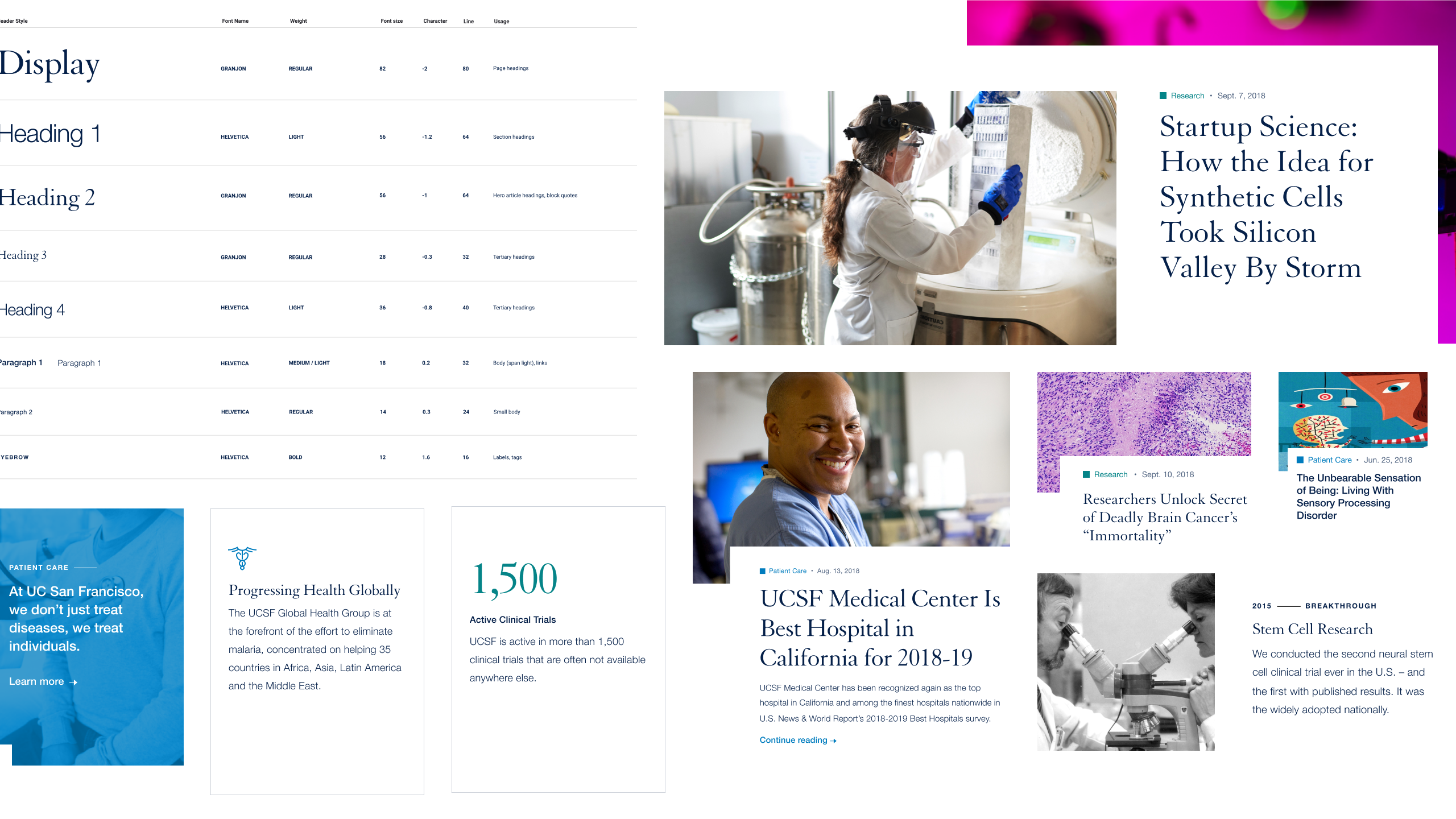
Focusing on editorial content and thought leadership.
As opposed to UCSF Health, whose primary focus was on patients, the academic side was shifting focus heavily to thought leadership and content creation. We adapted modules from UCSF Health to be more suited to EDU's needs, with multiple styles of categories, articles, and robust article pages to keep content feeling dynamic.
huge
Creative Direction
Chris Huban
ACD
Dan Schwer
UX Lead
Joan Winter
Design Lead
August Kreowski
Interaction Design
Molly Garber
Production Design
Jesus Arley Valencia
Strategy
Carrie Ko
Content
David Cohen
Engagement
Emily Hopp & Dani Whitlock
ucsf