Uber beacon.
Beacon is the first in-car communication device by Uber. Given as a gift to drivers who have achieved a certain level in the Uber Pro loyalty program, beacon is designed to improve the lives of drivers by providing important information and addressing key pain points.
While another director drove the physical and packaging design of beacon, my role was to define the scope and approach of the core beacon experience and product onboarding. I resourced and lead a team of brand designers, product designers, motion designers, copywriters, and a 3D render agency in bringing the experience to life. We worked closely with a cross-functional team of engineers, product managers, PMMs, UX researchers, and driver product design stakeholders to ensure a collaborative process.
While designing the core experience, I also served as creative director as marketing teams built out different channels like web and email.
Vision
An assistant built to let you shine.
Goals
Improved ride experience.
Enable easier, safer, more efficient pickups and rides for riders and drivers.
Driver engagement.
Create a means of showing driver appreciation.
Safety.
Consistent, reliable sensor data to improve safety, mapping, and navigation. Encourage safe behavior for both riders and drivers.
Brand.
An iconic brand symbol that serves as a moving billboard.
User insights.
Drivers take pride in their work and view beacon as an opportunity to improve their service to riders.
Drivers are excited to see beacon address common pain points: door slamming, seatbelt reminders, left belongings, and ETA updates.
Drivers compared receiving beacon to the excitement of a new gadget and want to set up ASAP.
Timeline.
Before resourcing or kicking off, I created a sprint plan to align with the Product, Eng, and PMM working team. By establishing a two-week sprint cadence, we ran a collaborative design process with clear expectations. We were able to plan for several rounds of user testing, which included not just the beacon's digital experience, but also physical and product onboarding.
Education before adoption.
As part of our announcement, we developed a robust set of communications spanning web and CRM to ensure drivers became familiar with the key features beacon offers. I directed an agency, Laundry, in the creation of 3D assets that would be used across marketing and product.
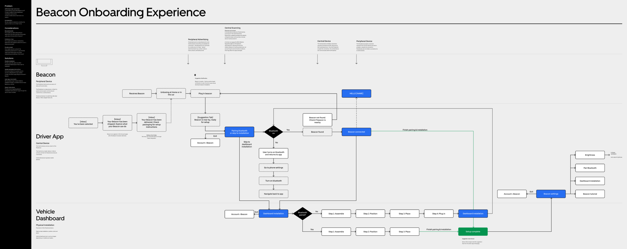
A complicated onboarding.
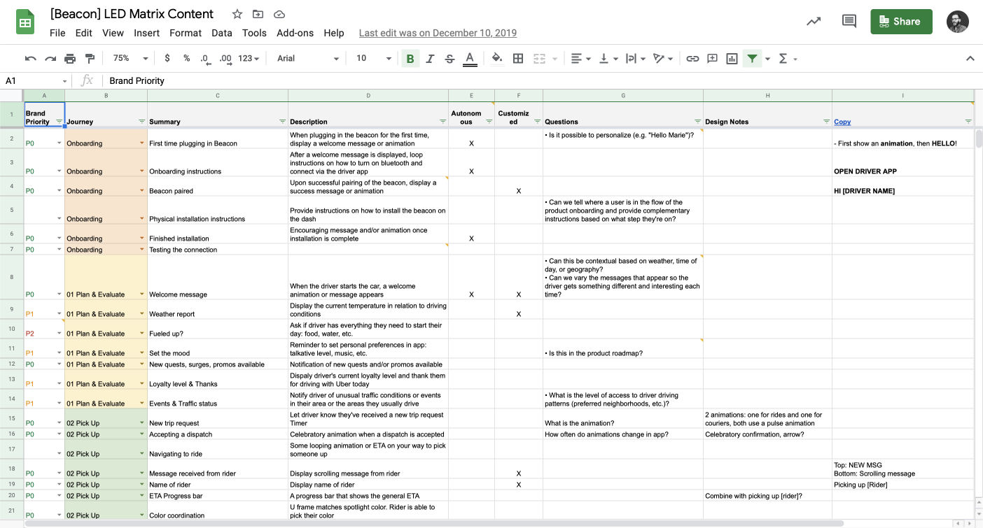
Onboarding to beacon involved an incredible amount of complexity spanning across digital and physical environments. We created a comprehensive user journey map to align across the working team and ensure we covered all possibilities.
Your beacon.
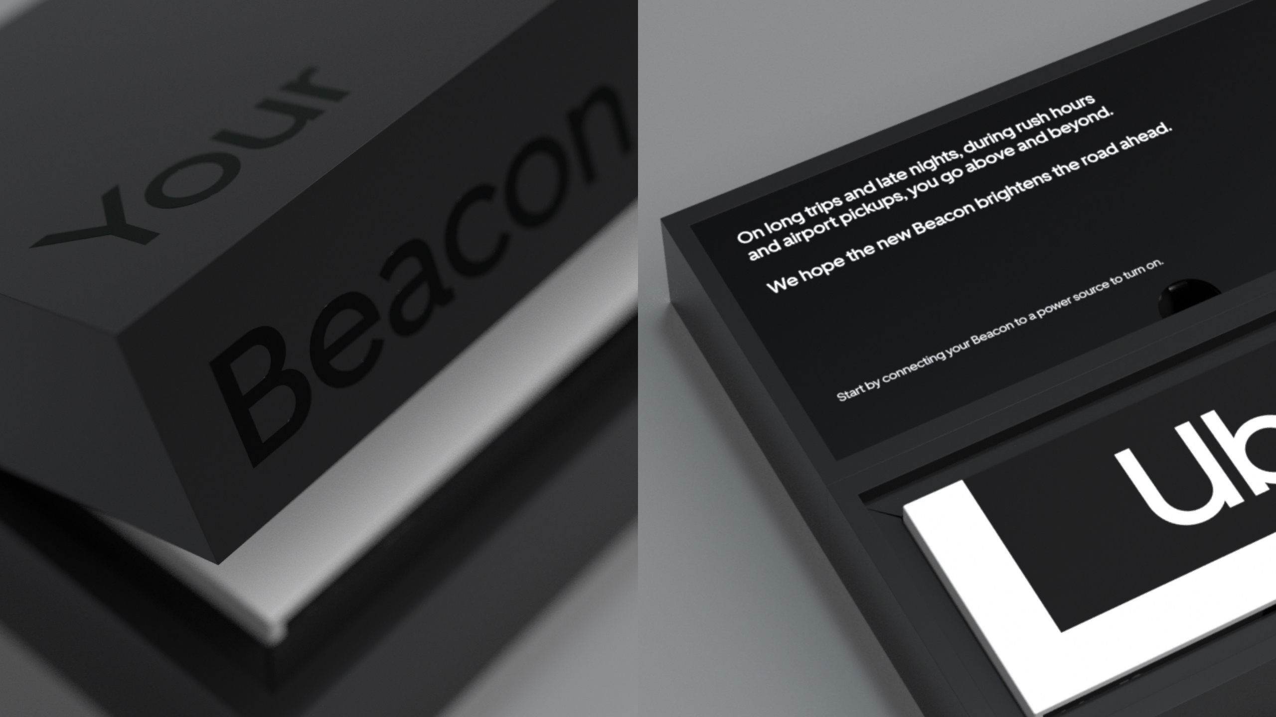
Building off the perceived excitement of receiving a beacon, we decided to lead with a message of appreciation, followed quickly by the first step in the onboarding process: connecting beacon to a power source. This first step sets up a seamless bluetooth connection process further down the line.
Complementing product with print.
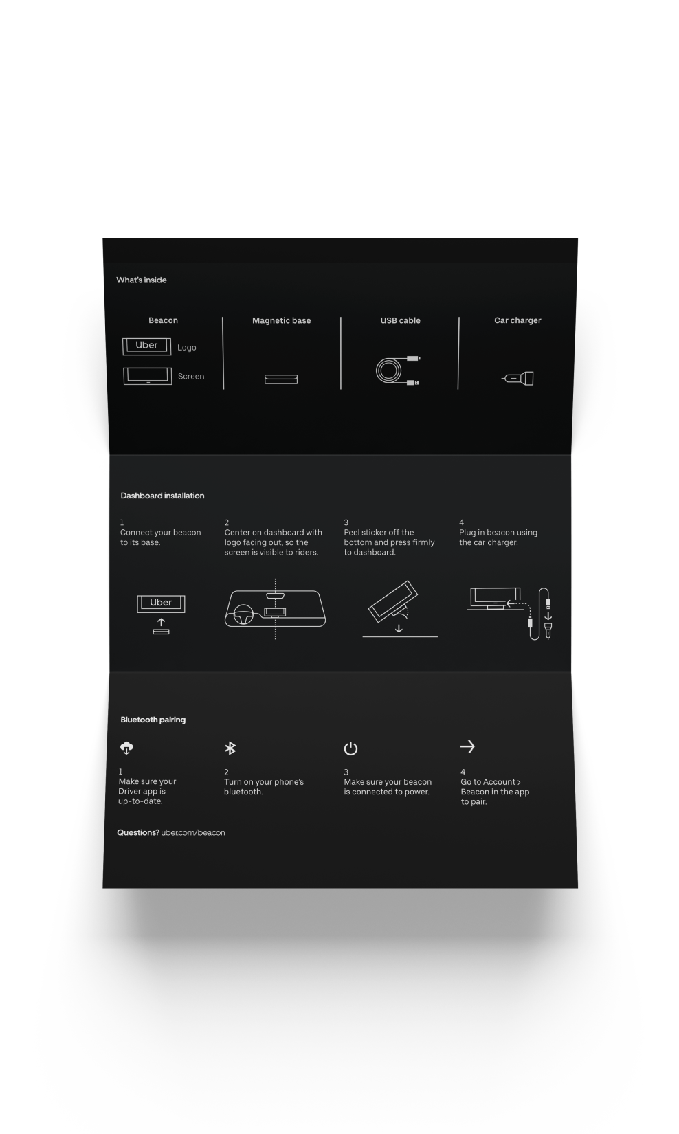
In early rounds of user testing, we didn't include any print onboarding, thinking we could rely on the driver app to do the heavy lifting. What we learned is that drivers immediately attempted to install beacon without opening their app, leading to confusion and frustration. We developed a print insert within the package that decreased failure rates to almost zero.
Two paths to success.
The original product onboarding was designed with one linear path, guiding drivers through bluetooth connection then on to physical installation. Through several rounds of user testing, we consistently saw drivers try to set up beacon in different ways—some skipped bluetooth after unboxing and just wanted to physically install. We settled on a flow that provides branching paths, giving drivers control and flexibility in the process.
Designing and prototyping for an unusual surface.
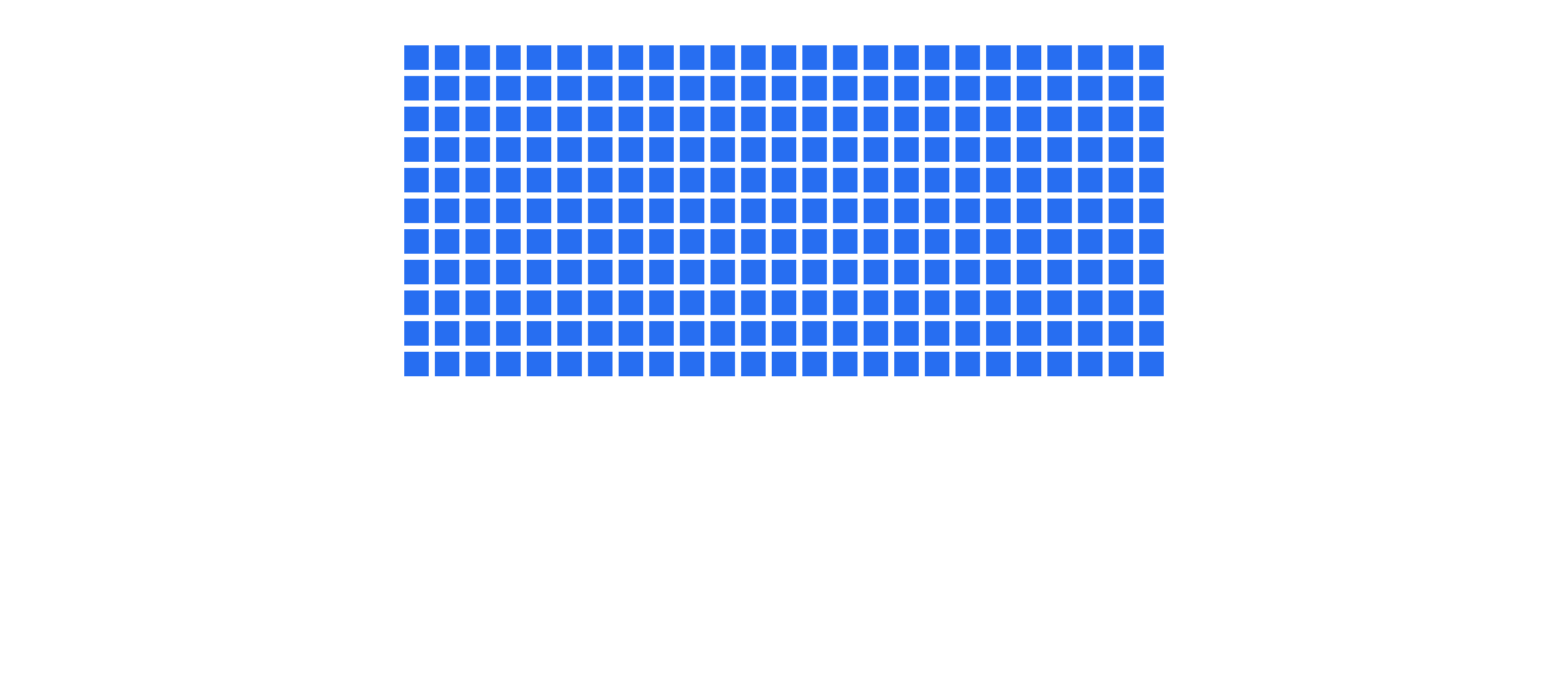
The beacon itself was designed with 13 color LEDs on the front (forming the "U-frame") and a 25x11 white-only LED grid on the back. Through a series of trial and error with our eng partners, we developed an android app with which we could load GIFs that would be transferred to the physical beacon. This allowed us to prototype GIFs in design and in user testing.
A bespoke typeface.
When designing the PXL typeface, we considered several factors: width, monospace, readability, and form vs function. Each trial font was developed in Illustrator, redrawn in a font editor, then handed over to motion designers to prototype on the beacon itself.
During this process, we learned how unforgiving the LEDs were in showing pixels that weren't perfectly aligned to the grid. This presented a significant challenge when working in After Effects and required several rounds of refinement across AE and the font editor to ensure pixel perfection every time.
Beacon experience principles.
Coming out of our UXR and concept sprints, we developed a series of principles to guide our design choices based on user and internal feedback.
Humanize the ride.
Whether a celebratory congratulations or a goodbye at the end of the day, the beacon is an opportunity to bring a little humanity to the ride.
Stand for safety.
Focus on alleviating pain points and identifying moments in the journey wheere safety is a concern. Consider the impact on driver distraction and personal privacy.
Simplicity rules.
The beacon is not the place for complex information or interactions. Messaging should be simple and direct, with complexity living within the app.
Differentiate from product.
The beacon presents an opportunity to complement and differentiate from in-app messaging. Only in special cases should the beacon duplicate information.
Staying aligned throughout the process.
As part of concepting, I lead a workshop with the extended team to brainstorm blue-sky feature ideas. These ideas were captured and organized based on the user journey. At the beginning of each sprint, product, eng, and design aligned on our areas of focus based on time, feasibility, and potential value for drivers.
Starting the day off right.
When drivers first start the car, beacon lights up to tell them what they missed while they were offline. New tips, five star ratings, and quest progress are key elements in the driving experience and information that help to motivate.
Identifying the right moments to reinforce product.
Considering beacon is yet another addition to the driver's dashboard, we were very conscious of when and why beacon should display redundant information to the driver app. As a core part of the driving experience, we decided going online and new ride requests qualified for reinforcement.
In user testing we learned that some drivers preferred beacon's larger screen, even going so far as to request turn-by-turn directions on beacon.
Picking up riders.
Beacon helps inform which side of the road the rider is on and displays the rider's name, helping drivers to identify their riders more effectively.
Getting in the (right) car.
When riders first get in their car, beacon welcomes them by name, confirms the driver's name, then reminds them to buckle up. With these simple reinforcements, beacon helped drive down wrong rider ticket rates.
Approaching the destination.
As the ride comes to an end, beacon asks riders to check for their belongings, exit on the right side of the street, and remember not to slam the door. These three simple messages help to address some of the main pain points drivers identified in user testing.
Results.
Getting started is easy.
Unanimous feedback around ease of setup. Drivers found the enclosed instructions very helpful.
A sense of excitement.
“I remember the box. It was nice. It was like woah. I was thinking about doing a YouTube video of unboxing the beacon.”
The beacon's messages are a welcome feature.
Drivers find messages useful in communicating more effectively, especially when language is a barrier. Drivers want access to personalization.
brand
Industrial Design Direction
Monina Dolan
Experience Design Direction
Dan Schwer
Packaging Design
Braz de Pina
Motion Design
Bryan Cobonpue & Andy Mai
Product Design
Karen Chiu
Typography
Erik Gomez & Braz de Pina
Renders
Laundry
product